U.S. Labor Force Declines by 720K

October Unemployment Manipulation

– By: Larry Walker II –

The big story out of the October household survey was the decline by 720,000 in the headline labor force, which largely reflected the loss of longer-term unemployed into the broader U-6 unemployment measure.

In fact, since January 2009, the U.S. Labor Force has only grown by 607,000. Yet, over the same period, 11,034,000 persons have been removed from the labor force (see chart above). Once removed, such are neither counted as employed nor unemployed, each amounting to the equivalent of zero-fifths of a person in terms of modern governmental accounting.

In Manipulation 101: The Real Unemployment Rate, we learned that as the size of the labor force erodes, the unemployment rate artificially declines. So let’s recall how the unemployment rate is calculated. The unemployment rate is calculated by dividing the number of unemployed persons by the size of the labor force:

[ (A) Total Unemployed / (B) Labor Force = (C) Unemployment Rate ]

Thus, the official unemployment rate of 7.3%, as reported by the Bureau of Labor Statistics (BLS) on its November 8, 2013, Employment Situation Report, was calculated as follows:

However, when the 720,000 longer-term unemployed which were removed from the labor force in October are added back, the real unemployment rate actually rose to 7.7% (shown above). And, if we were to add back all long-term unemployed workers, removed from the labor force since February 2009, the real unemployment rate would be 13.4% (also shown above).

As I reported earlier this year, in Black Unemployment Rate Closer to 37.9%, there is an alternative to the federal government’s phony reporting. Shadow Government Statistics publishes a more accurate measure of unemployment based on pre-1994 BLS methodology. The seasonally-adjusted SGS Alternate Unemployment Rate reflects current unemployment reporting methodology adjusted for SGS-estimated long-term discouraged workers, who were defined out of official existence in 1994.

In other words, the SGS Alternate Rate adds millions of long-term discouraged workers back to the BLS estimate, which only includes short-term discouraged workers. In case you didn’t catch that, this means the BLS has eliminated long-term discouraged workers (i.e. those who have been without a job for so long that they haven’t bothered to look for work in more than 12 months) from official unemployment statistics since 1994, thus distorting the true employment situation.

Accordingly, although the Bureau of Labor Statistics boasts of an official U-3 unemployment rate of 7.3%, and an official U-6 rate of 13.8%, the real unemployment rate, based on pre-1994 BLS methodology, has actually increased from 18.3% in January 2009 to 23.5% as of October 2013 (shown above).

Of course the Chief of the White House will simply continue to repeat something like, ‘Now that we’ve fixed (i.e. effed up) the nation’s health care system, it’s time to finish fixing (i.e. effing up) the economy.’

“How long, O LORD? Will you forget me forever? How long will you hide your face from me?” ~ Psalm 13:1 (ESV)

Related: #unemployment #manipulation

U.S. Government Manufactures 469,000 Jobs

Phony Current Employment Statistics (CES)

“How many legs does a dog have if you call the tail a leg? Four. Calling a tail a leg doesn’t make it a leg.” ― Abraham Lincoln

– By: Larry Walker, Jr. –

According to the U.S. Bureau of Labor Statistics (BLS), via its September 26th CES Preliminary Benchmark Announcement, the number of Private Sector Jobs reported in March 2013 was overstated by 136,000, and the number of Government jobs was understated by 12,000. But not to be outdone by a deteriorating economic reality, the BLS eliminated this bad news through a major change in its reporting methodology. After the change, instead of an overstatement of 124,000 nonfarm jobs (-136,000 + 12,000), the BLS will instead be reporting a net gain of 345,000 jobs on its January 2014 employment situation report. It’s magic!

Here’s what the BLS said (emphasis mine), followed by the translation in plain English.

“Each year, employment estimates from the Current Employment Statistics (CES) survey are benchmarked to comprehensive counts of employment for the month of March. These counts are derived from State Unemployment Insurance (UI) tax records that nearly all employers are required to file. For National CES employment series, the annual benchmark revisions over the last 10 years have averaged plus or minus three-tenths of one percent of Total nonfarm employment. The preliminary estimate of the benchmark revision indicates an upward adjustment to March 2013 Total nonfarm employment of 345,000 (0.3 percent). This revision is impacted by a large non-economic code change in the Quarterly Census of Employment and Wages (QCEW) that moves approximately 469,000 in employment from Private households, which is out-of-scope for CES, to the Education and health care services industry, which is in scope. After accounting for this movement, the estimate of the revision to the over-the-year change in CES from March 2012 to March 2013 is a downward revision of 124,000.”

What this means in plain English is that the BLS has once again changed the rules of the game, this time adding an estimated 469,000 Private Household Employees to its accounting of private sector jobs. So what’s wrong with that? Aren’t private household employees considered part of the private sector? The answer is no. Private household employees have never before been considered part of the private sector. The main reasons they have not been are as follows: (1) the BLS has no way of knowing how many household employees really exist, (2) no idea how many are considered full-time, part-time or temporary, and (3) will have virtually no way of tracking changes in the number of such employees on a monthly basis (i.e. its reports are issued monthly).

Unlike private sector businesses, which are surveyed monthly and file quarterly employment reports, private households are not surveyed in the same manner and only file employment reports on an annual basis. According to the Internal Revenue Service (IRS), although household employees are most commonly associated with child care providers, such as nannies, private household employees also include service providers such as gardeners, cleaning personnel or maids, babysitters, housekeepers, private nurses or home health aids and drivers or chauffeurs. Since such employees have never been included in private sector reporting in the past, the federal government’s employment statistics after January 2014 will be forever inconsistent with every prior period.

The table above, courtesy of the BLS, shows the March 2013 preliminary benchmark revisions by major industry sector. I have added a second column showing the changes without the addition of the newly concocted 469,000 private household employees. As you can clearly see, consistent with all prior CES statistics, there are actually 124,000 fewer nonfarm jobs than previously reported.

The bottom line: The number of private sector jobs reported in March 2013 was overstated by 136,000. The number of government jobs reported for the same period was understated by 12,000. That’s reality. Those are the facts. Just like the Bureau of Economic Analysis has been overstating Gross Domestic Product due to changes in its reporting methodology, the BLS has been following suit. As the U.S. economy continues to crumble, aside from QE3, the only tool the federal government has left to combat this new reality is to lie through its teeth. Changing the rules midstream in order to paint a rosy economic scenario through phony statistical reporting is not only dishonest, but reprehensible. The problem with lying is that eventually reality catches up. When there are no longer any warning signs, yet the national economy collapses, who will you blame?

Related:

2013 GDP Growth Rate Closer to -1.75% ― Phony Government Statistics: GDP

Black Unemployment Rate Closer to 37.9% ― Phony Government Statistics, Detroit and Black Americans

Entertainment R&D Boosts Federal GDP Calculation Following Formula Changes

The new GDP methodology: What you need to know: U.S. economy over $500 billion larger due to new definitions

Government Economic Reports: What You’ve Suspected but Were Afraid to Ask.

2013 GDP Growth Rate Closer to -1.75%

Phony Government Statistics: GDP

– By: Larry Walker, II –

“There are six things that the Lord hates, seven that are an abomination to him: haughty eyes, a lying tongue, and hands that shed innocent blood, a heart that devises wicked plans, feet that make haste to run to evil, a false witness who breathes out lies, and one who sows discord among brothers.” ~ Proverbs 6:16-19 ~

Gross Domestic Product (GDP) is one of the broader measures of economic activity and is the most widely followed business indicator reported by the U.S. government. But according to Economist Walter J. Williams of Shadow Government Statistics, “Upward growth biases built into GDP modeling since the early 1980’s have rendered this important series nearly worthless as an indicator of economic activity… With reported growth moving up and away from economic reality, the primary significance of GDP reporting now is as a political propaganda tool and as a cheerleading prop for Pollyannaish analysts on Wall Street.”

On August 29, 2013, the Federal Government reported that Real Gross Domestic Product — the output of goods and services produced by labor and property located in the United States — increased at an annual rate of 2.5 percent in the second quarter of 2013 (that is, from the first quarter to the second quarter), according to the “second” estimate released by the Bureau of Economic Analysis (BEA). In the first quarter, real GDP increased 1.1 percent. (The BEA will release its final number for the second quarter 2013 on September 26, 2013, at 8:30 A.M. EDT.)

However, this GDP headline number refers to the most-recent quarter’s annualized quarter-to-quarter rate of change (what that quarter’s percent quarter-to-quarter change would translate into if compounded for four consecutive quarters). This can mean that the latest quarter can be reported with a positive annualized growth rate, while the actual annual rate of change is negative, as was the case for the 3rd quarter of 2009. So is the economy really growing or not?

Note: The chart above, courtesy of ShadowStats.com, shows Annual Growth (Year-to-Year Percent Change). This is not the annualized quarterly rate of change that serves as the headline number for the series.

Shadow GDP

According to Shadow Government Statistics, the annual growth percentage change in GDP for the second quarter 2013, based on Official BEA data, was a mere 1.64%. However, when the aforementioned upward biases, inserted into GDP since 1984, are removed, the annual growth percentage change for the second quarter 2013 was actually more like -1.75%.

In fact, if you study the chart above, in conjunction with source data courtesy of Shadow Government Statistics, other than an anemic growth rate of less than 0.51% for the first, second, and third quarters of 2004, based on pre-1984 methodology, annual GDP growth has been negative ever since the second quarter of 2000.

Even worse, every time the BEA makes a new Pollyannaish change in its GDP reporting methodology, all prior data is restated back to the year 1929. For example, according to Shadow Government Statistics, methodological changes made in 2004 led to increases in previously reported GDP of 2.86% for 1980, and 5.25% for 1990 (see table below).

Unless this nonsense is reigned in, I suspect that in the near future, the Great Depression will be referred to as the Booming 30’s. Should you wish to study this topic further, please take a few moments to read the series authored by Walter J. “John” Williams, “Government Economic Reports: Things You’ve Suspected But Were Afraid To Ask!

The Bottom Line: Nearly every key statistic reported by the Federal Government is a lie. Virtually every word emanating from Washington, DC is a lie. Although the American people may be exceptional, the Government of the United States, as it stands today, has strayed so far from the mark that there will be none other to blame as it seals its own demise.

Related:

Black Unemployment Rate Closer to 37.9%: Phony Government Statistics, Detroit and Black Americans

Entertainment R&D Boosts Federal GDP Calculation Following Formula Changes

The new GDP methodology: What you need to know: U.S. economy over $500 billion larger due to new definitions

Black Unemployment Rate Closer to 37.9%

“I am a firm believer in the people. If given the truth, they can be depended upon to meet any national crisis. The great point is to bring them the real facts.” ~ Abraham Lincoln ~

Phony Government Statistics, Detroit and Black Americans

– By: Larry Walker II –

One way the federal government could help reduce Black-on-Black crime and address the nation’s poverty crisis would be to start telling the truth about unemployment. The U.S. Bureau of Labor Statistics (BLS) publishes a set of completely phony statistics each and every month, in order to convince the public that our economic condition is rosier than it appears. However, if the economy is doing so well, then why has the number of Americans living in poverty recently spiked to levels not seen since the mid-1960s? What’s up with that? Could it be that the employment situation and more specifically Black unemployment is far worse than government statistics portend?

For example, in December 2009, the BLS estimated that the official unemployment rate in Detroit, Michigan was 27.0%. However, at the same time, Detroit Mayor Dave Bing stated that the city’s official unemployment rate was as believable as Santa Claus, proffering that it was instead closer to 50.0%. Considering that less than four years later, Detroit would file the largest municipal bankruptcy in U.S. history, he was probably on the right track. So how did Mayor Bing come up with his figure?

Well, the BLS estimated that for the year ending September 2009, the State of Michigan’s official unemployment rate was 12.6%, but according to its broadest definition of unemployment, the state unemployment rate was 20.9%, or 66.0% higher than the official rate. Therefore, since the City of Detroit’s official unemployment rate for October 2009 was 27.0%, applying the broader rate meant the city’s rate was really as high as 44.8% (27.0 * 1.66). Since Mayor Bing’s estimate was more in the ballpark than the BLS, it might be a good idea to apply this same logic nationwide, especially when it comes to Black Americans, who as a whole have traditionally sustained the nation’s worst levels of unemployment.

Real Unemployment

Every month, the BLS publishes its official U-3 unemployment rate, a headline number that almost everyone is familiar with, but also releases the lesser known U-6 unemployment rate, its broadest measure of unemployment. U-6 includes short-term discouraged and other marginally-attached workers as well as those forced to work part-time because they cannot find full-time work. When we compare current BLS statistics, which are based on a flawed methodology only in place post-1993, against its pre-1994 methodology, we discover that the official U-3 rate is really closer to 12.8%, not the 7.4% figure published on August 2, 2013, and that the broader U-6 rate is really closer to 23.3%, rather than 14.0%.

There is actually an alternative to the federal government’s phony reporting. A private organization, Shadow Government Statistics, publishes a more accurate measure of unemployment, which is based on pre-1994 BLS methodology. The seasonally-adjusted SGS Alternate Unemployment Rate reflects current unemployment reporting methodology adjusted for SGS-estimated long-term discouraged workers, who were defined out of official existence in 1994. In other words, the SGS Alternate Rate adds millions of long-term discouraged workers back to the BLS estimate, which only includes short-term discouraged workers.

In case you didn’t catch that, allow me to clarify. What this means is the BLS has eliminated long-term discouraged workers (i.e. those who have been without a job for so long, they haven’t bothered to look for more than 12 months) from official unemployment statistics since 1994, thus distorting the real employment situation. And herein lies the problem: If you knew that a U.S. city was battling an unemployment rate of 27.0%, while the federal government was busy creating jobs in Egypt, China and everywhere else but that city, what would that tell you? Would it have made any difference if you knew that city’s unemployment rate was really 44.8% or greater? What do you think millions of long-term discouraged workers are up to, just sitting around laughing, joking and waiting on a government handout? Not likely, for an idle mind is the devil’s workshop.

To get a better idea of what’s really going on in America, we will begin by analyzing the federal government’s broadest measure of unemployment (U-6). Then we will compute the difference between U-6 and Shadow Government Statistics Alternate Unemployment Rate (Real U-6). Next, we’ll analyze the government’s official U-3 unemployment rate, then use the difference between U-6 and Real U-6 to extrapolate the real official unemployment rate (Real U-3). Finally, we will focus on unemployment among Black Americans, and using the same formula, project the real unemployment rate for Black Americans.

What’s the point? The first step in solving any problem is to define it. My mission today is to better define the problem, not necessarily solve it. There’s not a person in this nation, with the exception of those who still believe in Santa Claus, who truly believes the official unemployment rate is 7.4%, as of August 2, 2013, or that the total unemployment rate is just 14.0%. Nor is there any way on earth that Black folks, especially those in or around inner-cities, believe the Black unemployment rate is just 12.6%. So let’s get real. With that, here we go.

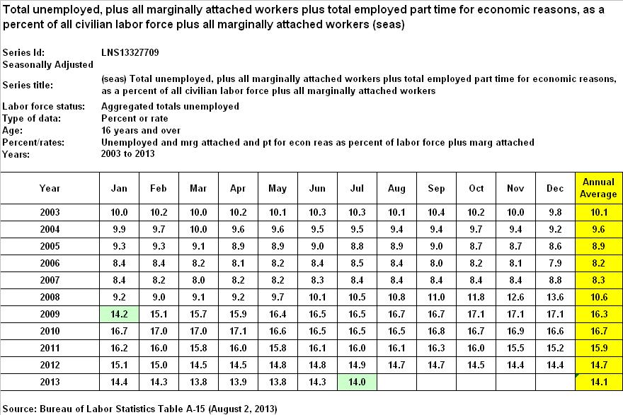
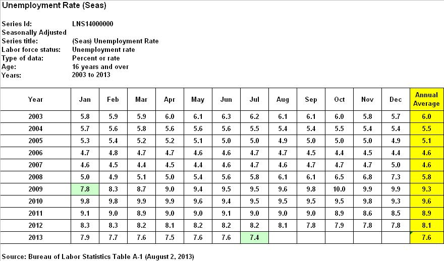
U-6 – Total Unemployment

When it comes to the federal government’s broadest measure of unemployment, U-6, according to the BLS the rate was 14.2% for January 2009, peaked at 17.1% in October through December of 2009, once again in April of 2010, and has since declined to 14.0%, as of July 2013. A closer look reveals the following annual averages, since 2003:

By comparison, U-6 averaged between 8.2% and 10.6% in the six years prior to the Great Recession, including 2008, the first full year thereof, but since the end of 2008 has averaged between 14.1% and 16.7%. What does that tell you? It tells me that notwithstanding the fact that the Great Recession ended in June of 2009, a solid four years ago, the total unemployment rate in 2013 is averaging 33.0% higher than in it did at the end of 2008 ((14.1 – 10.6) / 10.6), the first full year of the recession.

In other words, U-6 has grown 33.0% worse, since Potus 44 took the reigns, and that’s going by the government’s most optimistic estimates, based on a set of phony statistics which fail to count the number of long-term discouraged workers. Well, that’s not very encouraging.

SGS Alternate Unemployment Rate

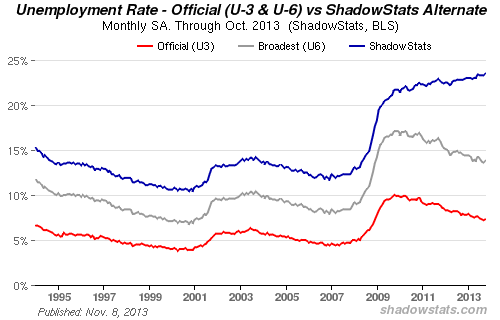
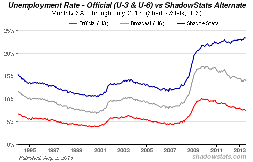
According to Shadow Government Statistics, the BLS has defined a certain segment of society, long-term discouraged workers, out of existence since 1994. It kind of sounds like the old three-fifths of a man theory, only now millions are counted as zero-fifths of a person, at least when it comes to official unemployment statistics. Oh you can vote alright, but if you’re poor, unemployed and haven’t searched for work in more than 12 month’s, you don’t really matter. Thus, the real unemployment rate is far worse than what the federal government would have us believe. The chart that follows is the latest from Shadow Government Statistics.

As you can see visually, and according to data from Shadow Government Statistics, for January 2009, instead of the federal government’s phony unemployment rates, U-3 of 7.8% and U-6 of 14.2%, real total unemployment (Real U-6) was actually 18.3%. But even more stunning is the fact that since January of 2009, instead of both rates peaking in 2009-2010 before declining to current BLS levels, Real U-6 has never declined, but has rather increased from 18.3% to 23.3%.

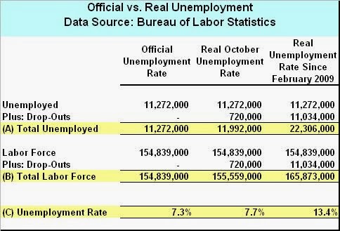
Summary Conclusion 1: The U-6 unemployment rate is really closer to 23.3%. When compared to the BLS U-6 rate, Real U-6 was 28.8% higher for January 2009 than we were led to believe ((18.3 – 14.2) / 14.2). Also, instead of declining, Real U-6 has since increased by an additional 27.3% ((23.3 – 18.3) / 18.3). In other words, Real U-6 is currently 64.0% worse than the BLS reported for January 2009 ((23.3 – 14.2) / 14.2). Got that?

U-3 – Official Unemployment

According to BLS, the official U-3 unemployment rate was 7.8% for January of 2009, peaked at 10.0% in October of 2009, and has since declined to 7.4% as of July 2013. A closer look reveals the following annual averages, since 2003:

By comparison, U-3 averaged between 4.6% and 6.0% in six years prior to the great recession, including 2008, the first full year thereof, but since the end of 2008 has averaged between 7.6% and 9.6%. Keeping in mind that the Great Recession officially commenced in December 2007 and ended in June of 2009, what does that tell you? It tells me that undeterred by the federal government’s phony statistics; U-3 is worse off today, on average, than after the first 13 month’s of the recession, which only lasted a total of 19 months.

In other words, in contempt of the fact that the Great Recession ended in mid-2009, just over four years ago, the average U-3 unemployment rate in 2013 is 31.0% worse than at the end of 2008 ((7.6 – 5.8) / 5.8). Although bad enough on its lonesome, remember that this is based on the federal governments most optimistic estimates, steeped in the same phony methodology mentioned above. So then what is the real unemployment rate?

Summary Conclusion 2: As shown in Summary Conclusion 1, the Real U-6 unemployment rate is currently 64.0% higher than the BLS reported for January 2009. Therefore, I contend that the real official unemployment rate (Real U-3) is also 64.0% greater than the government’s January 2009 figure. Since U-3 was said to be 7.8% for January 2009, Real U-3 is closer to 12.8% today (7.8 * 1.64). Are you still with me? Good. Now let’s look at the unemployment rate for Black Americans.
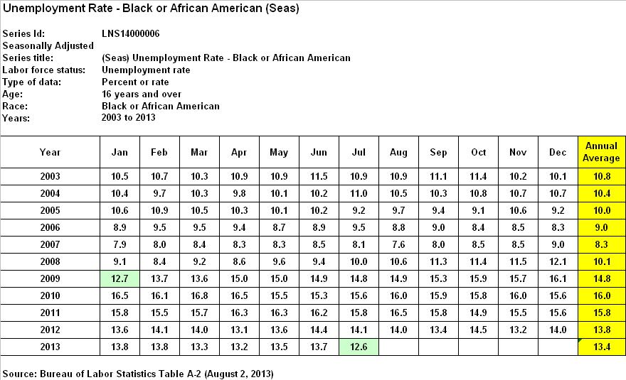
Black Unemployment

According to BLS, the official unemployment rate for Black Americans was 12.7% for January 2009, peaked at 16.8% in March of 2010, and is currently 12.6%, as of July 2013. A closer look reveals the following annual averages, since 2003:

By comparison, the official unemployment rate for Black Americans averaged between 8.3% and 10.8% in the six years prior the Great Recession, including 2008, the first full year thereof, but since the end of 2008 has averaged between 13.4% and 16.0%. Again, what does that tell you? It tells me that even though the Great Recession ended in mid-2009, more than 48 months ago, the average annual unemployment rate for Black Americans is now 32.6% worse than at the end of 2008 ((13.4 – 10.1) / 10.1).

In other words, the official Black unemployment rate has grown worse by 32.6%, since Potus 44 took the reigns. Yet again, I remind you that these are the federal government’s most optimistic estimates, based on phony BLS methodology, as mentioned above. [It’s worth noting that the unemployment rate for Black Americans more closely mimics the U-6 rate, and is currently 70.2% higher than the official U-3 rate ((12.6 – 7.4) / 7.4).] So even after reducing millions of Blacks to zero-fifths of a person, for unemployment purposes, the Black unemployment situation is completely unacceptable.

Summary Conclusion 3: As shown in Summary Conclusion 1, the Real U-6 unemployment rate is currently 64.0% higher than the BLS reported for January 2009. Therefore, I contend that the official unemployment rate for Black Americans is also 64.0% greater than the government’s January 2009 figure. Since the Black unemployment rate was reported to be 12.7% for January 2009, the official unemployment rate for Black Americans is really closer to 20.8% today (12.7 * 1.64), or 65.0% higher than BLS reported on August 2, 2013. But that’s not the end of the story.

Now we must take into consideration Detroit Mayor Dave Bing’s 2009 assessment of Detroit’s real unemployment rate. When we apply Mayor Bing’s formula to the nation as a whole, we can draw the following conclusion.

Conclusion: The official U-3 unemployment rate is really closer to 12.8%, as shown in Summary Conclusion 2. The total U-6 unemployment rate is really closer to 23.3%, as shown in Summary Conclusion 1, or 82.0% higher than Real U-3 ((23.3 – 12.8) / 12.8). Therefore, I contend that the total unemployment rate for Black Americans is also 82.0% higher than the figure shown in Summary Conclusion 3. Applying the broader measure means the unemployment rate for Black Americans is actually as high as 37.9% (20.8 * 1.82).

The Wrap

The first step in solving any problem is to define it. Publishing phony employment statistics is just one of the many games slick talking Washington politicians play to hide the truth. By masking reality since 1994, the U.S. government has been outright lying to itself and the general public for at least two decades. So what else are they lying about? What about inflation, GDP, the money supply, and carbon dioxide levels in the atmosphere, to name a few?

According to the federal government, as of July 2013, the official U-3 unemployment rate was 7.4%, U-6 total unemployment was 14.0%, and the official rate for Black Americans was 12.6%. But these are phony estimates, which fail to include the number of long-term discouraged workers. When we include those who should matter the most, those currently counted as zero-fifths of a person, we find that Real U-3 is 12.8%, Real U-6 is hovering at 23.3%, and the unemployment rate for Black Americans is really closer to 37.9%.

  • Real U-3: 12.8% (vs. 7.4%)

  • Real U-6: 23.3% (vs. 14.0%)

  • Black Unemployment: 37.9% (vs. 12.6%)

Not only has the unemployment rate grown 64.0% worse since January 2009, for all Americans, but the unemployment rate for Black Americans is really closer to 37.9% nationwide. However, within more problematic, high-crime, urban areas across the nation, such as Detroit, Black unemployment is now deathly critical. If you want to know the real unemployment rate in your city, state or locality, take the federal government’s official rate from January 2009, multiply it by 1.64, then take the result and multiply it again by 1.82, and you’ll have a more accurate figure.

When Potus 44 starts throwing around words like phony, as he prances around waving a golf club and berating folks for locking their car doors, he should be mindful that the very core of the government, over which he so arrogantly presides, may in fact be built on a lie. If Potus 44 truly believes the unemployment rate for Black Americans is 12.6%, then he should probably just take another nap, play another round of golf, give another incoherent speech, and then take another vacation. But if he believes the real unemployment rate for Blacks is closer to 37.9%, and construes it to be the main culprit behind poverty levels not seen since the mid-1960s, and a reason why 93% of Blacks are being murdered by other Blacks, then he should act accordingly.

However, race-baiting, raising the minimum wage, hiking income taxes, regulating the coal industry out of existence, delaying the Keystone XL Pipeline, and mandating that every American buy health insurance are all policies which lead to fewer job opportunities, not more. So perhaps the solution to our problem lies not in government doing more, but in government undoing much of what it has already done. My mission today was not to solve America’s problems, but rather to help define them. It’s high time the federal government starts giving us the truth. Now here’s a riddle: Detroit has fallen! Detroit has fallen! How long before the United States faces bankruptcy?

References:

Shadow Government Statisticshttp://www.shadowstats.com/alternate_data/unemployment-charts

Confounded InterestThe Daunting Gap In Unemployment and Homeownership By Race – Blacks In Last Place.

Real Effective Tax Rates | Romney’s versus Obama’s

Content of Character ::

According to a report released by the Tax Foundation, an effective federal tax rate of 14.0% is higher than what 97 percent of Americans pay.

– By: Larry Walker, Jr. –

And according to The Tax Policy Center, the average effective federal tax rate for all Americans, as a percentage of cash income, was only 9.3% in 2011. Those in the Top 20 Percent (with incomes over $103,465) paid an average of 14.9%, while those in the Bottom 20 Percent (with incomes below $16,812) received back refundable tax credits averaging 5.8% of their incomes.

Within the Top Quintile, the Top 1 Percent paid an average rate of 20.3%, while the Top 0.1 Percent paid an average of 19.8%. It’s important to note that these are averages, which means that within each quintile some pay more than the average and others less. But overall, since the average effective federal tax rate for all of America is 9.3%, this represents a kind of minimum benchmark. What’s your effective federal tax rate?

Under the traditional model, in 2011, Mitt and Ann Romney paid an effective federal tax rate of around 14.0% (see definitions at the end), while Barack and Michelle Obama paid 17.8% (see table below). So does that mean the Obamas are more patriotic? Before you answer that, consider that the Romneys paid a total of $1,912,529 in federal income taxes, versus the Obamas $150,253. So does this give the Romneys the upper hand?

Digging a little deeper, it turns out that the Romneys paid an effective state and local tax rate of 11.3%, compared to the Obamas 7.0%. The Romneys also paid $1,541,905 in state and local taxes, compared to the Obamas $59,804. Shouldn’t state and local taxes be counted as well, since they are, after all, taxes? Yes, of course.

So when all taxes are on the table, the Romneys overall effective tax rate was 25.2%, compared to the Obamas 24.8%. And, the Romneys paid a total of $3,454,434 in federal, state and local taxes, versus the Obamas $209,057. So in light of these facts, is one of the two presidential candidates better suited for the Oval Office than the other? Is one a tax deadbeat and the other a saint? If a presidential candidate’s effective tax rate matters, then this election should be a toss up. But if it doesn’t, then Barack Obama’s entire – fair share monologue – is nothing but rubbish. The question is – what really matters?

Real Effective Tax Rates

Perhaps a more suitable measure of patriotism may be found in one’s real effective tax rate. One way of lowering U.S. tax liabilities is through charitable giving. When gifts are given to charity, the taxpayer no longer controls the assets, and so is granted a deduction against his (or her) taxable income of as much as 50% of adjusted gross income. Depending upon one’s marginal tax bracket, the tax savings may be as high as 35% of the amount given.

What happens to the money once it has been gifted? It gets spent by recipient organizations on salaries and wages, goods and services, real property, or is otherwise invested toward its charitable endeavors. Thus, charity is wealth redistribution, or if you will, a type of voluntary taxation. I would add that charitable giving is a much more efficient means of spreading the wealth than the U.S. government’s wasteful method, which after a certain limit may be summed up as little more than legalized robbery.

In 2011, the Romneys gave away $4,000,000, or about 29.0% of their income, although they only chose to claim a tax deduction of $2,250,772. The Obamas donated $172,130 or about 20.0% of their income. When we add this voluntary taxation to the total amount of taxes paid, we find that the Romneys paid a real effective tax rate of 54.4%, compared to the Obamas 45.1% (see table below).

Just to add some perspective I included data from the Roosevelts and the Carters tax returns (above). It’s interesting to note that in 1937, Franklin and Eleanor Roosevelt donated $3,024, or only about 3.2% of their income, while in 1978, Jimmy and Roselynn Carter gave away $18,637, or about 7.0%. When we add the amount of the couples voluntary taxation through charitable gifts, to the total amount of taxes paid, we find that the Roosevelts paid a real effective tax rate of 33.3%, compared to the Carters 45.6%. So was FDR a slacker? Was Jimmy Carter slightly more patriotic than Obama? And isn’t Mitt Romney a better man than them all?

Note: The Roosevelts income of $93,602 in 1937 is equivalent to $1,504,178 today, while the Carters income of $267,195 in 1978 is equivalent to $948,325. A study of historical Presidential tax returns is interesting, informative, and highly recommended for anyone serious about tax reform, as is a study of historical income tax rates.

Tax Return Analysis: Romneys versus Obamas

Following are some other key statistics from the Romneys and Obamas tax returns:

It’s notable that 94.8% of the Romneys income came from investments – interest, dividends and capital gains, versus -12.8% for the Obamas. The Obamas tax return includes a capital loss carryover of $116,151, a consequence of failed investments from the past. That’s interesting, since Barack Obama is the one always harping on the idea of government investment, yet all the while it turns out that successful investing is a trait beyond the scope of his expertise. Small wonder his taxpayer-funded green energy investments have turned out to be dismal failures.

What’s even more notable is the fact that roughly 62.4% of the Romneys income came from capital gains and qualified dividends which, based on current law, are taxed at a maximum rate of 15.0%. In contrast, around 99.0% of the Obamas income came from wages and net book sales which are taxed at ordinary rates of as high as 35.0%. Thus the Romneys effective tax rate should be considerably lower than the Obamas; but it turns out that both couples effectively paid about the same overall effective tax rate, 25.2% versus 24.8%, as explained earlier. So in spite of favorable capital gains rates, overall effective tax rates tend to balance out. One reason for this phenomenon is that most of the States don’t reciprocate (i.e. there is no favorable capital gains rate at the state level).

Next, we find that the Romneys paid $102,790, or 0.8% of their income, in foreign taxes, while the Obamas paid $5,841, or 0.7%. Thus, on a percentage basis, both families earned about an equal amount of their income from foreign sources. So is either candidate more likely to outsource American jobs than the other? I guess Obama could limit sales of his books to the USA, and cut-off the rest of the world, as if that would make any sense. I’ll let you figure that one out.

Next, we discover that the Obamas claimed a retirement contribution deduction of $49,000, or 5.8% of their income, while the Romneys claimed none. Foul! The question is that since Barack Obama now qualifies for a $191,000 a year presidential pension, why is he continuing to maximize the simplified employee pension account (SEP) deduction? In the private sector, the most anyone can exclude from income for retirement purposes, including employer matching contributions, is $49,000 per year. Yet Barack Obama gets to claim this maximum deduction, while at the same time deferring taxes on the annual contributions the U.S. Treasury makes to his pension account. Does that sound fair to you? Is Obama paying his fair share?

Is a guaranteed $191,000 a year for life, on top of a virtually unlimited presidential expense account, insufficient for Mr. Obama? In stark contrast, Mitt Romney refused to take a salary while he served as Governor of Massachusetts. So has anyone bothered to ask if he would waive his presidential salary? Would he also consider waiving the presidential pension and lush lifetime expense account? Somebody needs to ask that question. By the way, Mitt Romney could have claimed exactly the same SEP-IRA deduction that the Obamas did, based on his net business income, which would have further reduced his tax liability, but chose not to. So what does this say about character?

Next, the Obamas also claimed a $47,564 home mortgage deduction amounting to 5.6% of their income, while the Romneys claimed none. Wow! So since the Obamas claimed both a $47,564 home mortgage deduction, and the $49,000 maximum retirement contribution exclusion, while the Romneys claimed neither, this gave the Obamas an 11.4% handicap. Note: According to the Internal Revenue Service, in tax year 2010, only 25.8% of tax filers claimed the home mortgage deduction, which kind of makes the case for placing limits on this deduction.

Now when it comes to charitable contributions, as stated earlier, the Romneys gave $4,000,000, or around 29.2% of their income, while the Obamas gave $172,130, or 20.4%. But since the Romneys only chose to write-off $2,250,772, their actual deduction amounted to just 16.4% of their income. So once again the Obamas had a slight advantage, yet when their total itemized deductions are compared, we find that the Romneys amounted to 34.2% of their income, while the Obamas amounted to 33.0%, or about the same.

Finally, the Romneys federal taxes included an Alternative Minimum Tax (AMT) of $674,512, representing 4.9% of their income, while the Obamas incurred a liability was $12,491, or 1.5%. The AMT limits certain deductions and tax preferences to ensure that high income earners pay at least a minimum amount of tax. So what will happen when the AMT is eliminated? Will the rich pay less in taxes? Not necessarily, because if the same deductions and tax preferences for high income earners were eliminated from the get go, then the AMT wouldn’t be necessary. Isn’t this the objective of tax reform, to eliminate deductions and preferences, lower tax rates, and thus simplify the tax code? So when tax rates are cut by 20% in the next year or two, and that’s where we’re headed, the first place to look for deductions and preferences to eliminate is within current AMT regulations.

Content of Character

So what’s the point? First of all, we learned that in 2011, the Romneys paid a total of $3,454,434 in federal, state and local taxes, while the Obamas paid $209,057. When state and local taxes were added to the mix, we found that the Romneys paid an overall effective tax rate of 25.2%, versus the Obamas 24.8%. But when charitable contributions were figured in, we discovered that the Romneys paid a real effective tax rate of 54.4% compared to the Carters 45.6%, the Obamas 45.1%, and the Roosevelts 33.3%.

What should be clear is that measuring a person by the size of their effective tax rate reveals nothing about their character. If those who pay the largest share of taxes are the most patriotic among us, then that all but eliminates everyone except for the Top 1 Percent. If effective tax rates are so important, then why not simply convert to a flat tax (i.e. the FairTax)? That way the concept of effective tax rates becomes meaningless. In a perfect world it seems this would be the goal.

Is paying more taxes than absolutely necessary savvy? No, but anyone who voluntarily pays more must really love this country. Mitt and Ann Romney didn’t claim all of the charitable contributions they could have, and thus paid a higher amount in taxes than legally required. When it comes down to it, no one that I know cares anything about increasing their own personal effective tax rate; most are like the Obamas, preoccupied with finding ways to reduce it.

The main point of this post has been to prove that measuring any American by the size of their effective tax rate reveals next to nothing about the content of their character. Thus, Barack Obama’s entire fair share mantra turns out to be nothing but rubbish. The rich already pay more than their fair share sir. It’s time to bring on a business guy, someone who really understands what’s going on in this country. It’s time to lower income tax rates, limit deductions and preferences, broaden the tax base, and reduce the size of government. It’s time to lower the federal deficit and move towards a balanced budget. It’s time to purge Barack Obama’s jaded philosophy of – do as I think, not as I do.

Definitions:

(a) The Traditional Model – Under the traditional model, the effective tax rate is calculated by dividing total income taxes (before tax credits and other taxes), by total income (before exclusions and deductions).

(b) Effective Federal Tax Rate – The effective federal tax rate is determined by dividing total federal income taxes (before tax credits and other taxes), by total income (before exclusions and deductions).

(c) Effective State and Local Tax Rate – The effective state and local tax rate is determined by dividing total state income taxes, real estate taxes, and personal property taxes claimed on federal Schedule A, by total income (before exclusions and deductions).

(d) Overall Effective Tax Rate – The overall effective tax rate is calculated by dividing total federal income taxes (before tax credits and other taxes), plus total state and local taxes as in (c), by total income (before exclusions and deductions).

(e) Real Effective Tax Rate – The real effective tax rate is calculated by dividing total federal income taxes (before tax credits and other taxes), plus state and local taxes as in (c), plus charitable contributions, by total income (before exclusions and deductions).

References:

The Romneys 2011 Tax Return

The Obamas 2011 Tax Return

The Roosevelts 1937 Tax Return

The Carters 1978 Tax Return

Romney’s Taxes: A Window Into Charitable Giving

Even at 14%, Romney Pays a Higher Rate than 97% of His Fellow Americans

Ex-presidents have huge expense accounts

President Obama’s Taxpayer-Backed Green Energy Failures

2011 Tax Increase : A Reality Check

Income Tax Reality Check

Compiled by: Larry Walker, Jr.

“If you make less than $250,000, you will not see your taxes increase by one dime.” ~ B. H. Obama

Left-wing pundits are claiming that the Bush tax cuts were for the wealthy, which is simply not true. Next year when the 10% tax bracket disappears, and tax rates return to pre-2001 levels, will represent an across the board tax increase affecting every American. In addition, the child tax credit will return from $1,000 (per child under age 17) to $500 representing a tax increase for everyone who has children, not the wealthy. The fact is that the Bush tax cuts applied to every American at every level of income, and when they expire taxes will rise from the bottom up.

In 2011, if you make over a nickel in taxable income, your taxes will increase a minimum of 9%, and as much as 50%. Since our tax rates are progressive, taxes on the first $16,750 for couples ($8,375 for singles) will increase by 50%. Taxpayers who make under $8,375 in taxable income will see the largest tax increase at 50%. Middle income earners will see their taxes rise by no less than 9%. The contention that the Bush tax cuts only affected the wealthy is a bald-faced lie. Similarly, the contention that Obama’s tax increases will only affect the wealthy is nothing but a fairy tale. Americans are educated and can comprehend income tax tables. You can choose to believe whatever you want, but reality should not be optional.

2010 Tax Brackets

Nickel over at fivecentnickel.com has projected how the 2011 income tax brackets may look. The commentary below is attributed to Nickel. I have retouched his 2011 table (below), and added the 2010 table (above) for comparison.

Income tax bracket changes for 2011 – In case you weren’t aware, the Bush tax cuts of 2001 and 2003 are set to expire at the end of 2010. Thus, if Congress doesn’t act, the relatively low income tax rates that we’ve been enjoying (hah! enjoying?) will soon be a thing of the past. They will be replaced by the pre-2001 tax brackets.

In other words, the 10%, 15%, 25%, 28%, 33% and 35% tax brackets that we’ve grown accustomed to will be replaced by 15%, 28%, 31%, 36%, and 39.6% brackets. It’s hard to say exactly where the income cutoffs will lie, but if we base the numbers on the 2010 income tax brackets and add 3% for inflation, the 2011 tax brackets might look something like this:

2011 Projected Tax Brackets

Capital gains tax changes in 2011 – Beyond the increased federal income tax brackets, the capital gains tax rates will also be changing (and not for the better). The top rate for long-term capital gains will be rising from 15% to 20%, and the 0% rate for those in the lowest tax brackets will be replaced by a 10% long-term capital gains rate.

Why worry about 2011 income tax changes? – Since the 2011 tax year is so far off, you might be wondering why we’re even talking about it right now. Well, as I noted above, the time to be planning for things like this is right now – before the changes go into effect as these potential income tax rates have the potential to take a big bite out of your savings account.

What sort of planning should you be doing? I can think of several things off the top of my head. For starters, if you’re in a position to accelerate income from 2011 into 2010, you might want to do so. In many cases this is easier said than done, but it’s worth exploring if you’d like to shield your income from the potentially higher rates.

Also, if you’re anything like me, you may wait until the end of the year to make your charitable donations. If so, then by waiting just a few more days (until January 1, 2011) to write that check, you could net a substantial tax savings. While you’d have to wait longer to claim the deduction, it might be worth it.

Similarly, if you anticipate selling investments to generate cash during 2011, you might consider moving that up to the end of 2010 to get in on the (presumably) lower capital gains tax rates.

Reference: http://www.fivecentnickel.com/2010/02/15/2011-federal-income-tax-brackets-irs-income-tax-rates/

Getting Honest About Social Security – Part 3

We begin with the Congressional Budget Office’s Estimate of the President’s Budget (above). Why wait until tomorrow? It’s on the CBO’s website at http://cbo.gov/?

You will recall from Part 2, that entitlement spending (aka mandatory spending) is comprised of the following:

Entitlement Spending, at $1.595 trillion in FY 2008, is over half of the U.S. Federal Budget. The largest entitlement spending programs based on FY 2006 were Social Security and Medicare, as follows:
  • Social Security – $544 billion
  • Medicare – $325 billion
  • Medicaid – $186 billion
  • All other mandatory programs – $357 billion. These programs include Food Stamps, Unemployment Compensation, Child Nutrition, Child Tax Credits, Supplemental Security for the blind and disabled, Student Loans, and Retirement / Disability programs for Civil Servants, the Coast Guard and the Military
In FY 2009 and 2010 alone, entitlement spending is projected to exceed government revenue by some $290 billion. So the United States is facing a budget deficit, in just two years, before spending one dime on our defense, education, veterans pensions, and other vital programs. And this wasn’t supposed to happen for another 31 years?

Is anyone still seriously considering dumping another $1 trillion dollars into this government-run ponzi scheme?

Obama said he wanted an ‘honest debate’ on his health care proposal. Well, here’s the problem. We can’t afford to waste another dollar on some misguided government program, no matter how noble. Social Security is little more than a government-run Ponzi Scheme. Medicare is only 1/2 funded by premiums. Isn’t Medicare an example of government-run health care?

What kind of health insurance company would only collect 1/2 of what it spends on claims year-after-year, after year? I’ll tell you. A government-run health insurance company. Like that commercial says Mr. president, “You Need A Plan!”

Solutions abound, but what Obama is proposing isn’t one of them.

To even begin an ‘honest’ discussion on Social Security, Medicare, Government Option Health Care, or any other ‘reform’ proposed by ‘government workers’, you first need to get honest with the public, and then your proposals had better include the following:

  • Reductions in government spending
  • Reductions in government programs
  • Privatization of government entitlement programs
  • Budget balancing initiatives
  • Incentives for private investment
  • Incentives for private business growth
  • Incentives for private job creation
  • and, Policies that promote individual liberty

Getting Honest About Social Security – Part 2

What are Entitlements?

Entitlement Spending, at $1.412 trillion in FY 2006, is over half of the U.S. Federal Budget. The largest entitlement spending programs are Social Security and Medicare, as follows:

  • Social Security – $544 billion

  • Medicare – $325 billion

  • Medicaid – $186 billion

  • All other mandatory programs – $357 billion. These programs include Food Stamps, Unemployment Compensation, Child Nutrition, Child Tax Credits, Supplemental Security for the blind and disabled, Student Loans, and Retirement / Disability programs for Civil Servants, the Coast Guard and the Military

How Is Social Security Funded?

Social Security is funded through payroll taxes. Through 2017, Social Security collects more in tax revenues than it pays out in benefits because there are 3.3 workers for every beneficiary. However, as Baby Boomers start to retire and draw down these benefits, there will be fewer workers to support them. By 2040, the revenues to pay for Social Security will be less than the expenditures.

How Is Medicare Funded?

Unlike Social Security, Medicare payroll taxes and premiums cover only 57% of current benefits. The remaining 43% is financed from general revenues (i.e. including any surplus remaining from Social Security). Because of rising health care costs, general revenues will have to pay for 62% of Medicare costs by 2030.

Medicare has two sections:

  • The Medicare Part A Hospital Insurance program, which collects enough payroll taxes to pay current benefits.

  • Medicare Part B, the Supplementary Medical Insurance program, and Part D, the new drug benefit, which is only covered by premium payments and general tax revenues.

How Will the FY 2008 Budget on Entitlement Spending Affect the U.S. Economy?

Through 2012, entitlement spending is budgeted at about 10.5% of GDP, with payroll tax revenue at about 6.5% of GDP, so that these unfunded obligations add to the general budget deficit. For example, in FY 2006 Social Security brought in $608 billion in “off-budget,” extra funds from payroll taxes. However, other entitlement programs had expenses that far outweighed this “extra” revenue, creating a mini-deficit of $574 billion within the entitlement spending budget alone. The amount increases to $784 billion by 2012.

Long-term Impacts

Long-term, however, the impact of doing nothing about these burgeoning unfunded mandates will be huge. The first Baby-Boomer turns 62 this year, and becomes eligible to retire on Social Security benefits. By 2025, those aged 65+ will comprise 20% of the population.

As Boomers leave the work-force and apply for benefits, three things happen:

  1. The percentage of the labor under 55 stops growing, providing less payroll taxes to fund Social Security.

  2. GDP growth declines to less than 2% due to fewer workers.

  3. By 2040, Social Security alone brings in less than it spends.

Getting Honest

Obama has stated that any further debate on his health care reform proposals needs to be “honest debate”. He implies that critics have been dishonest, which means we’re just lying.

In looking at the facts above, one need only ask the following question:

Are the budgetary problems facing ‘government workers’ in Washington, DC caused by the private sector, or by the government?

Obama wants to overthrow the private health insurance industry and fold it into a government run entitlement. Yet, the federal government has proven itself incapable of managing its current programs. How is adding more of the burden to the government going to resolve the baby boomer issue?

With all due respect, as a wise man once stated, “government is not the solution to our problems, government is the problem.”

What we need to be discussing is a way to turn over the government’s primary entitlements: Social Security and Medicare to the private sector, not the other way around. If not, the next thing ‘government workers’ will be proposing is how they can fold State, and private pension money into the black hole of the Social Security Ponzi Fund.

Obama’s solution: Solve a problem by compounding it. “We have to spend more money to keep from going bankrupt.”

American’s are simply saying, “No”.

Getting Honest About Social Security – Part 1

Reality

The maximum social security benefit for 2009 for a person retiring at full retirement age (66) is $2,323. This is based on earnings at the maximum taxable amount for every year after age 21.

Analysis based on maximum benefits:

  • The total paid into the system by, or on behalf of, the recipient by the age of 66 is $266,377 ($235,042 of this since 1980).
  • The total paid in by the age of 66 with 3% compound annual interest is $394,785.
  • By the age of 74, the recipient will receive a full return of the amount paid in on their behalf without interest.
  • By the age of 77, the recipient will receive a full return of the amount paid in on their behalf with interest compounded at 3% annually.
  • Assuming the funds continue to receive a return of 3% through the annuity phase, the funds would last up to the age of 80.

So by the age of 74 the total paid in by the recipient plus amounts matched by employers are exhausted. If the government were able to achieve a meager 3% rate of return, the total savings at the time of retirement would be exhausted by the age of 77. Assuming a 3% return on investment during the annuity phase, the funds should last through the age of 80.

However, in reality, the average monthly benefit for social security recipients is only $1,061 per month or $12,732 per year in 2009. There are currently some 51.8 million recipients receiving some $55.0 billion in benefits each month.

Dishonesty

The only problem and it is a major problem, in fact it is a problem many times worse than the alleged health care crisis, is the fact that the government has stolen the Social Security Trust Fund. There is no trust fund. There are ‘no’ dollars in savings for the government to invest and receive even a meager 3% return. Every dollar paid into the fund this month will be spent this month, and then some.

Worse than that, the Federal Government has run up a National Debt of $11 trillion, and intends to increase this debt by another $9 trillion over the next 10 years. With the peak of baby boomers hitting retirement age in 2019, a $20 trillion National Debt, longer life expectancy, and a smaller workforce, how are politicians going to be able to keep this “ponzi” scheme going?

Honesty

It is clear to me that Washington, DC cannot be trusted with taxpayer’s money. We need to get the Federal Government the heck out of the retirement business. And don’t even talk to me about letting the government take over health care. I’m not hearing it.

We need to work on solutions that will allow American citizens to save for their own retirement, and to be able to pay for their own health care. At the same time, we have to figure out how to untangle ourselves from this massive ponzi scheme which politicians have gotten us into.

As far as I’m concerned, any solution that involves spending another dollar of taxpayer’s money better include a detailed cost benefit analysis. Any solution to the problems of our time that doesn’t involve drastic cuts in spending by the federal government is not a solution.

To even begin an honest discussion on social security, Medicare, health care or any other political issue being discussed these days, ‘government workers’ had better get honest with the public, and their proposals had better include the following:

  • Reductions in government spending
  • Reductions in government programs
  • Privatization of government entitlement programs
  • Budget balancing initiatives
  • Incentives for private investment
  • Incentives for private business growth
  • Incentives for private job creation
  • Policies that promote individual liberty

References:

http://www.ssa.gov/policy/docs/quickfacts/stat_snapshot/

http://ssa-custhelp.ssa.gov/cgi-bin/ssa.cfg/php/enduser/std_adp.php?p_faqid=5&p_created=955050377

http://www.socialsecurity.gov/OACT/COLA/cbb.html

https://blackandcenter.blog/2009/08/16/the-cbo-and-our-common-welfare/

http://www.cbo.gov/doc.cfm?index=10297

http://www.usnews.com/articles/opinion/mzuckerman/2009/08/10/deficit-means-massive-tax-hike-years-of-misery-if-obama-wont-cut-spending.html