U.S. Labor Force Declines by 720K

October Unemployment Manipulation

– By: Larry Walker II –

The big story out of the October household survey was the decline by 720,000 in the headline labor force, which largely reflected the loss of longer-term unemployed into the broader U-6 unemployment measure.

In fact, since January 2009, the U.S. Labor Force has only grown by 607,000. Yet, over the same period, 11,034,000 persons have been removed from the labor force (see chart above). Once removed, such are neither counted as employed nor unemployed, each amounting to the equivalent of zero-fifths of a person in terms of modern governmental accounting.

In Manipulation 101: The Real Unemployment Rate, we learned that as the size of the labor force erodes, the unemployment rate artificially declines. So let’s recall how the unemployment rate is calculated. The unemployment rate is calculated by dividing the number of unemployed persons by the size of the labor force:

[ (A) Total Unemployed / (B) Labor Force = (C) Unemployment Rate ]

Thus, the official unemployment rate of 7.3%, as reported by the Bureau of Labor Statistics (BLS) on its November 8, 2013, Employment Situation Report, was calculated as follows:

However, when the 720,000 longer-term unemployed which were removed from the labor force in October are added back, the real unemployment rate actually rose to 7.7% (shown above). And, if we were to add back all long-term unemployed workers, removed from the labor force since February 2009, the real unemployment rate would be 13.4% (also shown above).

As I reported earlier this year, in Black Unemployment Rate Closer to 37.9%, there is an alternative to the federal government’s phony reporting. Shadow Government Statistics publishes a more accurate measure of unemployment based on pre-1994 BLS methodology. The seasonally-adjusted SGS Alternate Unemployment Rate reflects current unemployment reporting methodology adjusted for SGS-estimated long-term discouraged workers, who were defined out of official existence in 1994.

In other words, the SGS Alternate Rate adds millions of long-term discouraged workers back to the BLS estimate, which only includes short-term discouraged workers. In case you didn’t catch that, this means the BLS has eliminated long-term discouraged workers (i.e. those who have been without a job for so long that they haven’t bothered to look for work in more than 12 months) from official unemployment statistics since 1994, thus distorting the true employment situation.

Accordingly, although the Bureau of Labor Statistics boasts of an official U-3 unemployment rate of 7.3%, and an official U-6 rate of 13.8%, the real unemployment rate, based on pre-1994 BLS methodology, has actually increased from 18.3% in January 2009 to 23.5% as of October 2013 (shown above).

Of course the Chief of the White House will simply continue to repeat something like, ‘Now that we’ve fixed (i.e. effed up) the nation’s health care system, it’s time to finish fixing (i.e. effing up) the economy.’

“How long, O LORD? Will you forget me forever? How long will you hide your face from me?” ~ Psalm 13:1 (ESV)

Related: #unemployment #manipulation

Give Up 300,000 Federal Workers… and then we’ll talk.

U.S. Government Shutdown: Negotiation 101

– By: Larry Walker II –

“Treasury Secy. Jack Lew warns the country will run out of money later this month. Actually, that’s another lie. The country ran out of money $17 trillion ago. It’s all borrowed since then, much of it by this administration.” ~ Andrew Malcolm *

The United States federal government shutdown of 1995 and 1996 was the result of conflicts between Democratic President Bill Clinton and the Republican Congress over funding for Medicare, education, the environment, and public health in the 1996 federal budget. The government shut down after Clinton vetoed the spending bill the Republican Party-controlled Congress sent him. The federal government of the United States put non-essential government workers on furlough and suspended non-essential services from November 14 through November 19, 1995 and from December 16, 1995 to January 6, 1996, for a total of 28 days. The major players were President Clinton and Speaker of the U.S. House of Representatives Newt Gingrich.

According to the U.S. Bureau of Labor Statistics, in November of 1995, near the beginning of the shutdown, there were 2,152,900 federal government employees, excluding postal workers. By January 1996, at the end of the shutdown, this number had been trimmed by 110,300, to 2,042,600. After the parties reached an agreement, the number of federal workers was further slashed, by an additional 184,900, falling to it’s lowest point in more than 30 years, all the way to 1,857,700 by October of 2000 (see chart below).

Looking back a bit farther, there were 2,309,200 federal employees in December of 1992, so the number had already been slashed by 254,600 from the time Bill Clinton entered office until the shutdown. All in all, the federal government was able to rid itself of 451,500 non-essential employees between the years 1993 and 2000. Simply amazing!

Unfortunately, since October of 2000, the number of federal employees has grown by 291,200, reaching 2,148,900 by August of 2013. How quickly we forget. But the situation today is even more dire. According to the Cato Institute, “Total wages and benefits paid to executive branch civilians will be about $248 billion in 2013, indicating that compensation is a major federal expense that can be trimmed. During the last decade, compensation of federal employees rose faster than compensation of private-sector employees. As a consequence, the average federal civilian worker now earns 74 percent more in wages and benefits than the average worker in the U.S. private sector.” What’s up with that?

Keeping in mind that the only time the federal budget has balanced in our lifetimes was between the years 1996 and 2000, and putting aside partisan B.S. for a moment, what does that tell you? Was it just a coincidence that balancing the federal budget during this time-frame entailed slashing the number of federal workers to the lowest level in more than three decades? No it wasn’t.

The Bottom Line: What this should tell us is that among the 900,000 (or so) non-essential federal workers just placed on furlough, at least 300,000 need to be sent packing – permanently. There’s no way the federal budget will ever balance again, until the federal government takes serious measures to reduce its own size. The private sector is not the problem; government is the problem. Now is not the time to add new entitlement programs, and ever more federal employees, rather like 1995 it’s time to slash and burn. Give up 300,000 federal workers, then, and only then, may we engage in an adult conversation regarding the remainder of the federal budget.

References and Related:

Chart: Overpaid Federal Workers – Cato Institute

If 900,000 federal workers can be furloughed as ‘non-essential,’ why employ them? – Investor’s Business Daily

Make the Shutdown of Undesirable Federal Departments and Agencies Permanent: A Continuing Resolution is an abomination. – Ideal Taxes Association

U.S. Government Manufactures 469,000 Jobs – Natural Born Conservative

Watcher’s Council Nominations – Storming The Barrycades Edition – Watcher of Weasels

U.S. Government Manufactures 469,000 Jobs

Phony Current Employment Statistics (CES)

“How many legs does a dog have if you call the tail a leg? Four. Calling a tail a leg doesn’t make it a leg.” ― Abraham Lincoln

– By: Larry Walker, Jr. –

According to the U.S. Bureau of Labor Statistics (BLS), via its September 26th CES Preliminary Benchmark Announcement, the number of Private Sector Jobs reported in March 2013 was overstated by 136,000, and the number of Government jobs was understated by 12,000. But not to be outdone by a deteriorating economic reality, the BLS eliminated this bad news through a major change in its reporting methodology. After the change, instead of an overstatement of 124,000 nonfarm jobs (-136,000 + 12,000), the BLS will instead be reporting a net gain of 345,000 jobs on its January 2014 employment situation report. It’s magic!

Here’s what the BLS said (emphasis mine), followed by the translation in plain English.

“Each year, employment estimates from the Current Employment Statistics (CES) survey are benchmarked to comprehensive counts of employment for the month of March. These counts are derived from State Unemployment Insurance (UI) tax records that nearly all employers are required to file. For National CES employment series, the annual benchmark revisions over the last 10 years have averaged plus or minus three-tenths of one percent of Total nonfarm employment. The preliminary estimate of the benchmark revision indicates an upward adjustment to March 2013 Total nonfarm employment of 345,000 (0.3 percent). This revision is impacted by a large non-economic code change in the Quarterly Census of Employment and Wages (QCEW) that moves approximately 469,000 in employment from Private households, which is out-of-scope for CES, to the Education and health care services industry, which is in scope. After accounting for this movement, the estimate of the revision to the over-the-year change in CES from March 2012 to March 2013 is a downward revision of 124,000.”

What this means in plain English is that the BLS has once again changed the rules of the game, this time adding an estimated 469,000 Private Household Employees to its accounting of private sector jobs. So what’s wrong with that? Aren’t private household employees considered part of the private sector? The answer is no. Private household employees have never before been considered part of the private sector. The main reasons they have not been are as follows: (1) the BLS has no way of knowing how many household employees really exist, (2) no idea how many are considered full-time, part-time or temporary, and (3) will have virtually no way of tracking changes in the number of such employees on a monthly basis (i.e. its reports are issued monthly).

Unlike private sector businesses, which are surveyed monthly and file quarterly employment reports, private households are not surveyed in the same manner and only file employment reports on an annual basis. According to the Internal Revenue Service (IRS), although household employees are most commonly associated with child care providers, such as nannies, private household employees also include service providers such as gardeners, cleaning personnel or maids, babysitters, housekeepers, private nurses or home health aids and drivers or chauffeurs. Since such employees have never been included in private sector reporting in the past, the federal government’s employment statistics after January 2014 will be forever inconsistent with every prior period.

The table above, courtesy of the BLS, shows the March 2013 preliminary benchmark revisions by major industry sector. I have added a second column showing the changes without the addition of the newly concocted 469,000 private household employees. As you can clearly see, consistent with all prior CES statistics, there are actually 124,000 fewer nonfarm jobs than previously reported.

The bottom line: The number of private sector jobs reported in March 2013 was overstated by 136,000. The number of government jobs reported for the same period was understated by 12,000. That’s reality. Those are the facts. Just like the Bureau of Economic Analysis has been overstating Gross Domestic Product due to changes in its reporting methodology, the BLS has been following suit. As the U.S. economy continues to crumble, aside from QE3, the only tool the federal government has left to combat this new reality is to lie through its teeth. Changing the rules midstream in order to paint a rosy economic scenario through phony statistical reporting is not only dishonest, but reprehensible. The problem with lying is that eventually reality catches up. When there are no longer any warning signs, yet the national economy collapses, who will you blame?

Related:

2013 GDP Growth Rate Closer to -1.75% ― Phony Government Statistics: GDP

Black Unemployment Rate Closer to 37.9% ― Phony Government Statistics, Detroit and Black Americans

Entertainment R&D Boosts Federal GDP Calculation Following Formula Changes

The new GDP methodology: What you need to know: U.S. economy over $500 billion larger due to new definitions

Government Economic Reports: What You’ve Suspected but Were Afraid to Ask.

Black Unemployment Rate Closer to 37.9%

“I am a firm believer in the people. If given the truth, they can be depended upon to meet any national crisis. The great point is to bring them the real facts.” ~ Abraham Lincoln ~

Phony Government Statistics, Detroit and Black Americans

– By: Larry Walker II –

One way the federal government could help reduce Black-on-Black crime and address the nation’s poverty crisis would be to start telling the truth about unemployment. The U.S. Bureau of Labor Statistics (BLS) publishes a set of completely phony statistics each and every month, in order to convince the public that our economic condition is rosier than it appears. However, if the economy is doing so well, then why has the number of Americans living in poverty recently spiked to levels not seen since the mid-1960s? What’s up with that? Could it be that the employment situation and more specifically Black unemployment is far worse than government statistics portend?

For example, in December 2009, the BLS estimated that the official unemployment rate in Detroit, Michigan was 27.0%. However, at the same time, Detroit Mayor Dave Bing stated that the city’s official unemployment rate was as believable as Santa Claus, proffering that it was instead closer to 50.0%. Considering that less than four years later, Detroit would file the largest municipal bankruptcy in U.S. history, he was probably on the right track. So how did Mayor Bing come up with his figure?

Well, the BLS estimated that for the year ending September 2009, the State of Michigan’s official unemployment rate was 12.6%, but according to its broadest definition of unemployment, the state unemployment rate was 20.9%, or 66.0% higher than the official rate. Therefore, since the City of Detroit’s official unemployment rate for October 2009 was 27.0%, applying the broader rate meant the city’s rate was really as high as 44.8% (27.0 * 1.66). Since Mayor Bing’s estimate was more in the ballpark than the BLS, it might be a good idea to apply this same logic nationwide, especially when it comes to Black Americans, who as a whole have traditionally sustained the nation’s worst levels of unemployment.

Real Unemployment

Every month, the BLS publishes its official U-3 unemployment rate, a headline number that almost everyone is familiar with, but also releases the lesser known U-6 unemployment rate, its broadest measure of unemployment. U-6 includes short-term discouraged and other marginally-attached workers as well as those forced to work part-time because they cannot find full-time work. When we compare current BLS statistics, which are based on a flawed methodology only in place post-1993, against its pre-1994 methodology, we discover that the official U-3 rate is really closer to 12.8%, not the 7.4% figure published on August 2, 2013, and that the broader U-6 rate is really closer to 23.3%, rather than 14.0%.

There is actually an alternative to the federal government’s phony reporting. A private organization, Shadow Government Statistics, publishes a more accurate measure of unemployment, which is based on pre-1994 BLS methodology. The seasonally-adjusted SGS Alternate Unemployment Rate reflects current unemployment reporting methodology adjusted for SGS-estimated long-term discouraged workers, who were defined out of official existence in 1994. In other words, the SGS Alternate Rate adds millions of long-term discouraged workers back to the BLS estimate, which only includes short-term discouraged workers.

In case you didn’t catch that, allow me to clarify. What this means is the BLS has eliminated long-term discouraged workers (i.e. those who have been without a job for so long, they haven’t bothered to look for more than 12 months) from official unemployment statistics since 1994, thus distorting the real employment situation. And herein lies the problem: If you knew that a U.S. city was battling an unemployment rate of 27.0%, while the federal government was busy creating jobs in Egypt, China and everywhere else but that city, what would that tell you? Would it have made any difference if you knew that city’s unemployment rate was really 44.8% or greater? What do you think millions of long-term discouraged workers are up to, just sitting around laughing, joking and waiting on a government handout? Not likely, for an idle mind is the devil’s workshop.

To get a better idea of what’s really going on in America, we will begin by analyzing the federal government’s broadest measure of unemployment (U-6). Then we will compute the difference between U-6 and Shadow Government Statistics Alternate Unemployment Rate (Real U-6). Next, we’ll analyze the government’s official U-3 unemployment rate, then use the difference between U-6 and Real U-6 to extrapolate the real official unemployment rate (Real U-3). Finally, we will focus on unemployment among Black Americans, and using the same formula, project the real unemployment rate for Black Americans.

What’s the point? The first step in solving any problem is to define it. My mission today is to better define the problem, not necessarily solve it. There’s not a person in this nation, with the exception of those who still believe in Santa Claus, who truly believes the official unemployment rate is 7.4%, as of August 2, 2013, or that the total unemployment rate is just 14.0%. Nor is there any way on earth that Black folks, especially those in or around inner-cities, believe the Black unemployment rate is just 12.6%. So let’s get real. With that, here we go.

U-6 – Total Unemployment

When it comes to the federal government’s broadest measure of unemployment, U-6, according to the BLS the rate was 14.2% for January 2009, peaked at 17.1% in October through December of 2009, once again in April of 2010, and has since declined to 14.0%, as of July 2013. A closer look reveals the following annual averages, since 2003:

By comparison, U-6 averaged between 8.2% and 10.6% in the six years prior to the Great Recession, including 2008, the first full year thereof, but since the end of 2008 has averaged between 14.1% and 16.7%. What does that tell you? It tells me that notwithstanding the fact that the Great Recession ended in June of 2009, a solid four years ago, the total unemployment rate in 2013 is averaging 33.0% higher than in it did at the end of 2008 ((14.1 – 10.6) / 10.6), the first full year of the recession.

In other words, U-6 has grown 33.0% worse, since Potus 44 took the reigns, and that’s going by the government’s most optimistic estimates, based on a set of phony statistics which fail to count the number of long-term discouraged workers. Well, that’s not very encouraging.

SGS Alternate Unemployment Rate

According to Shadow Government Statistics, the BLS has defined a certain segment of society, long-term discouraged workers, out of existence since 1994. It kind of sounds like the old three-fifths of a man theory, only now millions are counted as zero-fifths of a person, at least when it comes to official unemployment statistics. Oh you can vote alright, but if you’re poor, unemployed and haven’t searched for work in more than 12 month’s, you don’t really matter. Thus, the real unemployment rate is far worse than what the federal government would have us believe. The chart that follows is the latest from Shadow Government Statistics.

As you can see visually, and according to data from Shadow Government Statistics, for January 2009, instead of the federal government’s phony unemployment rates, U-3 of 7.8% and U-6 of 14.2%, real total unemployment (Real U-6) was actually 18.3%. But even more stunning is the fact that since January of 2009, instead of both rates peaking in 2009-2010 before declining to current BLS levels, Real U-6 has never declined, but has rather increased from 18.3% to 23.3%.

Summary Conclusion 1: The U-6 unemployment rate is really closer to 23.3%. When compared to the BLS U-6 rate, Real U-6 was 28.8% higher for January 2009 than we were led to believe ((18.3 – 14.2) / 14.2). Also, instead of declining, Real U-6 has since increased by an additional 27.3% ((23.3 – 18.3) / 18.3). In other words, Real U-6 is currently 64.0% worse than the BLS reported for January 2009 ((23.3 – 14.2) / 14.2). Got that?

U-3 – Official Unemployment

According to BLS, the official U-3 unemployment rate was 7.8% for January of 2009, peaked at 10.0% in October of 2009, and has since declined to 7.4% as of July 2013. A closer look reveals the following annual averages, since 2003:

By comparison, U-3 averaged between 4.6% and 6.0% in six years prior to the great recession, including 2008, the first full year thereof, but since the end of 2008 has averaged between 7.6% and 9.6%. Keeping in mind that the Great Recession officially commenced in December 2007 and ended in June of 2009, what does that tell you? It tells me that undeterred by the federal government’s phony statistics; U-3 is worse off today, on average, than after the first 13 month’s of the recession, which only lasted a total of 19 months.

In other words, in contempt of the fact that the Great Recession ended in mid-2009, just over four years ago, the average U-3 unemployment rate in 2013 is 31.0% worse than at the end of 2008 ((7.6 – 5.8) / 5.8). Although bad enough on its lonesome, remember that this is based on the federal governments most optimistic estimates, steeped in the same phony methodology mentioned above. So then what is the real unemployment rate?

Summary Conclusion 2: As shown in Summary Conclusion 1, the Real U-6 unemployment rate is currently 64.0% higher than the BLS reported for January 2009. Therefore, I contend that the real official unemployment rate (Real U-3) is also 64.0% greater than the government’s January 2009 figure. Since U-3 was said to be 7.8% for January 2009, Real U-3 is closer to 12.8% today (7.8 * 1.64). Are you still with me? Good. Now let’s look at the unemployment rate for Black Americans.

Black Unemployment

According to BLS, the official unemployment rate for Black Americans was 12.7% for January 2009, peaked at 16.8% in March of 2010, and is currently 12.6%, as of July 2013. A closer look reveals the following annual averages, since 2003:

By comparison, the official unemployment rate for Black Americans averaged between 8.3% and 10.8% in the six years prior the Great Recession, including 2008, the first full year thereof, but since the end of 2008 has averaged between 13.4% and 16.0%. Again, what does that tell you? It tells me that even though the Great Recession ended in mid-2009, more than 48 months ago, the average annual unemployment rate for Black Americans is now 32.6% worse than at the end of 2008 ((13.4 – 10.1) / 10.1).

In other words, the official Black unemployment rate has grown worse by 32.6%, since Potus 44 took the reigns. Yet again, I remind you that these are the federal government’s most optimistic estimates, based on phony BLS methodology, as mentioned above. [It’s worth noting that the unemployment rate for Black Americans more closely mimics the U-6 rate, and is currently 70.2% higher than the official U-3 rate ((12.6 – 7.4) / 7.4).] So even after reducing millions of Blacks to zero-fifths of a person, for unemployment purposes, the Black unemployment situation is completely unacceptable.

Summary Conclusion 3: As shown in Summary Conclusion 1, the Real U-6 unemployment rate is currently 64.0% higher than the BLS reported for January 2009. Therefore, I contend that the official unemployment rate for Black Americans is also 64.0% greater than the government’s January 2009 figure. Since the Black unemployment rate was reported to be 12.7% for January 2009, the official unemployment rate for Black Americans is really closer to 20.8% today (12.7 * 1.64), or 65.0% higher than BLS reported on August 2, 2013. But that’s not the end of the story.

Now we must take into consideration Detroit Mayor Dave Bing’s 2009 assessment of Detroit’s real unemployment rate. When we apply Mayor Bing’s formula to the nation as a whole, we can draw the following conclusion.

Conclusion: The official U-3 unemployment rate is really closer to 12.8%, as shown in Summary Conclusion 2. The total U-6 unemployment rate is really closer to 23.3%, as shown in Summary Conclusion 1, or 82.0% higher than Real U-3 ((23.3 – 12.8) / 12.8). Therefore, I contend that the total unemployment rate for Black Americans is also 82.0% higher than the figure shown in Summary Conclusion 3. Applying the broader measure means the unemployment rate for Black Americans is actually as high as 37.9% (20.8 * 1.82).

The Wrap

The first step in solving any problem is to define it. Publishing phony employment statistics is just one of the many games slick talking Washington politicians play to hide the truth. By masking reality since 1994, the U.S. government has been outright lying to itself and the general public for at least two decades. So what else are they lying about? What about inflation, GDP, the money supply, and carbon dioxide levels in the atmosphere, to name a few?

According to the federal government, as of July 2013, the official U-3 unemployment rate was 7.4%, U-6 total unemployment was 14.0%, and the official rate for Black Americans was 12.6%. But these are phony estimates, which fail to include the number of long-term discouraged workers. When we include those who should matter the most, those currently counted as zero-fifths of a person, we find that Real U-3 is 12.8%, Real U-6 is hovering at 23.3%, and the unemployment rate for Black Americans is really closer to 37.9%.

  • Real U-3: 12.8% (vs. 7.4%)

  • Real U-6: 23.3% (vs. 14.0%)

  • Black Unemployment: 37.9% (vs. 12.6%)

Not only has the unemployment rate grown 64.0% worse since January 2009, for all Americans, but the unemployment rate for Black Americans is really closer to 37.9% nationwide. However, within more problematic, high-crime, urban areas across the nation, such as Detroit, Black unemployment is now deathly critical. If you want to know the real unemployment rate in your city, state or locality, take the federal government’s official rate from January 2009, multiply it by 1.64, then take the result and multiply it again by 1.82, and you’ll have a more accurate figure.

When Potus 44 starts throwing around words like phony, as he prances around waving a golf club and berating folks for locking their car doors, he should be mindful that the very core of the government, over which he so arrogantly presides, may in fact be built on a lie. If Potus 44 truly believes the unemployment rate for Black Americans is 12.6%, then he should probably just take another nap, play another round of golf, give another incoherent speech, and then take another vacation. But if he believes the real unemployment rate for Blacks is closer to 37.9%, and construes it to be the main culprit behind poverty levels not seen since the mid-1960s, and a reason why 93% of Blacks are being murdered by other Blacks, then he should act accordingly.

However, race-baiting, raising the minimum wage, hiking income taxes, regulating the coal industry out of existence, delaying the Keystone XL Pipeline, and mandating that every American buy health insurance are all policies which lead to fewer job opportunities, not more. So perhaps the solution to our problem lies not in government doing more, but in government undoing much of what it has already done. My mission today was not to solve America’s problems, but rather to help define them. It’s high time the federal government starts giving us the truth. Now here’s a riddle: Detroit has fallen! Detroit has fallen! How long before the United States faces bankruptcy?

References:

Shadow Government Statisticshttp://www.shadowstats.com/alternate_data/unemployment-charts

Confounded InterestThe Daunting Gap In Unemployment and Homeownership By Race – Blacks In Last Place.

Replacing Coal with Solar Energy — Let Me Count the Costs

“Suppose one of you wants to build a tower. Won’t you first sit down and estimate the cost to see if you have enough money to complete it?” ~ Luke 14:28 (NIV)

– By: Larry Walker, II –

During his 2011 State of the Union address, Potus announced a new U.S. energy target: Produce 80 percent of electricity from clean energy sources by 2035. Just this past week, two and a half years later, he announced that the centerpiece of his proposal involves deploying the EPA in a new war on the coal industry. But according to Rep. Tim Murphy (R-Allegheny), the House Chairman of the Energy and Commerce Oversight Committee, “This Administration has already closed one-fifth of US coal-fueled plants in the last four years and has made no secret about its anti-coal agenda.”

Although the topic has sparked an abundance of rhetoric from the lips of Potus, there’s been no mention of the cost to American households, to taxpayers at the federal and state levels, no hint of opportunity cost (the value of the best alternative forgone), nor of any economic benefits, but merely an odd discourse involving a man-made solution for regulating the Earth’s temperature, namely through taxing and regulating our largest source of electricity, coal fired power plants, out of existence. The unanswered questions surrounding Potus’ latest craze are as follows: How much is it going to cost? Who’s going to pay for it? And, how will it benefit America?

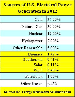
I recently came across an interesting article on Climate Central entitled, “Replacing Coal With Clean Energy — Let Me Count the Ways” (July 2011). The author, Alyson Kenward, ponders where all the new “clean energy” will come from after Potus destroys the coal industry. She explains that coal and natural gas produce about 70 percent of our electricity, nuclear power around 20 percent, renewable sources like wind and hydro-power roughly 10 percent, and how this ratio would need to change.

According to Potus, natural gas counts as clean energy, because even though it produces CO2, its emissions per kilowatt-hour (KWh) generated are only half as much as coal. Thus, if we were to leave all the current natural gas fired power plants in place, and not build any new ones, hitting the 80 percent target means that roughly 46% of the nation’s coal production would need to be replaced. As Ms. Kenward explained, and I concur, this won’t be a simple task, since coal alone currently provides 37% of America’s electricity.

Ignoring the costs, Ms. Kenward came up with six ways the U.S. could achieve Potus’ objective. Counting the costs, I have slightly revised and modified Ms. Kenward’s analysis, while maintaining its integrity, focusing on just one of her six possible ways, which I will call Method Number 4. After weighing the costs and benefits, we will be able to decide for ourselves whether or not Potus’ idea is feasible.

Method Number 4

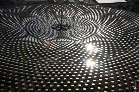
We could build 7,529 solar energy farms — but each one would have to be the size of Nevada’s Copper Mountain solar array.

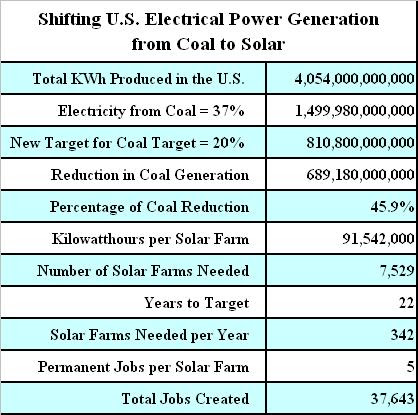
The U.S. produces just over 4 trillion KWh of electricity each year, of which coal is responsible for 1.5 trillion KWh, or 37%. In order to reduce the ratio of electricity produced from coal to 20% would require a substitute capable of generating roughly 689 billion KWh per year. Nevada’s Copper Mountain solar farm produces around 92 million KWh a year. So to reach Potus’ target would require building 7,529 similar solar farms over the next 22 years, or 342 per year.

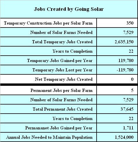
The Sempra Copper Mountain facility is a 55-megawatt solar farm, in Nevada, which spans 380 acres and contains 775,000 solar panels. Built between January and December of 2010, it was at the time the largest PV solar plant in the United States. One of its claims to fame was that it allegedly created 350 temporary construction jobs, yet the Las Vegas Sun pointed out some of its more glaring flaws:

  • Solar power coming to Nevada: 0. Zip.

  • Parts manufactured in Nevada: 0. Zilch.

  • Permanent jobs created: 5. That’s not a typo.

  • State incentives developer Sempra Generation received: $12 million. That’s not a typo, either.

Costs

According to the Los Angeles Times, “Capturing a free and clean source of energy is not cheap. Solar is the Cadillac of energy, with capital costs and other market factors making it three times more expensive than natural gas or coal. Ratepayers’ bills will be as much as 50% higher for renewable energy, according to an analysis from the consumer advocate branch of the state Public Utilities Commission.”

So not only will solar power cost more than three-times as much as coal to implement and produce, but when it’s all said and done our power bills will likely be more than 50% higher, as ratepayers’ pass their costs on to consumers. This fact alone should disqualify solar energy as a viable alternative for our electric power needs.

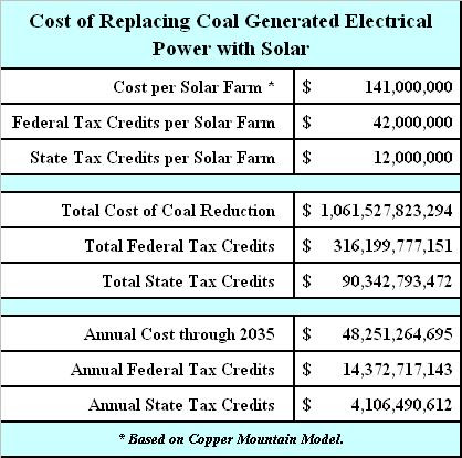
The Nevada Economic Development Commission said the project cost $141 million. The federal government gave Sempra Generation about $42 million in tax credits, 30 percent of the price tag for Copper Mountain. When we include the $12 million in state incentives, mentioned above, we find that 38% of its total cost was provided by federal and state tax dollars. That’s all well and good, except for the fact that we would have to replicate the process 7,529 more times in order to reach Potus’ target.

Using simple math puts the total cost of Potus’ grand scheme at around $1,061,527,823,294 ($141,000,000 times 7,529). That’s $1.1 trillion, with potentially $316 billion subsidized by the federal government, and $90 billion by state governments. Although over a 22-year period this only amounts to around $48 billion per year, with $14 billion subsidized by the federal government and another $4 billion by the states, we must next weigh the economic benefits?

In the matter at hand, a politician defending costs, without considering benefits, is akin to the federal government regulating the level of mercury emissions in the atmosphere, while simultaneously forcing every household in America to install mercury laced light bulbs. Frankly, I would rather have mercury way up in the atmosphere, than in the light fixture next to my bed. In other words, if the costs outweigh the benefits, a project may ultimately do more harm than good.

Short-Term Economic Benefits

Construction of the Copper Mountain plant created 350 temporary jobs, which theoretically lasted about a year, although we don’t know how that was calculated. There could have been high turnover (i.e. 175 jobs filled by 350 persons). However, if 7,529 similar plants were to be built, in raw terms, it may result in the creation of as many as 2,635,150 temporary construction jobs, over a period of 22 years. Although that sounds great, it only amounts to 119,780 temporary jobs each year, or 9,981 jobs per month.

The catch is that because these jobs are temporary in nature, lasting perhaps a year at most, theoretically the same crew would be moving around from job to job. The net result is that only a total of 119,780 jobs are created over the entire 22-year period. How’s that you say? Well, as next year’s 119,780 jobs are created, last year’s 119,780 jobs come to an end. So in terms of temporary construction jobs, at best only 119,780 are created through the year 2035, at which point they disappear entirely. Although one might presume any amount of jobs growth a positive, because the U.S. needs to create roughly 127,000 jobs each and every month, just to keep pace with population growth, in the near-term, going solar adds virtually nothing to our ailing economy.

Long-Term Economic Benefits

According to Speaker of the House John Boehner, the coal industry is responsible for 760,000 good paying permanent jobs. If that’s correct, then Potus’ goal of reducing the coal industry by 46% would result in a loss of perhaps 349,600 good paying permanent jobs, assuming the entire industry doesn’t collapse in the process. And remember, Copper Mountain created just 5 permanent jobs (that’s not a typo). So once Potus’ scheme is fully realized, after 22 years and $1.1 trillion are squandered, the U.S. will have created just 37,645 permanent jobs (5 * 7,529).

In the long run, Potus will have replaced 349,600 (or more) permanent full-time jobs with just 37,645, for a net loss of 311,955 jobs, an 80% reduction. Brilliant! By the year 2035, assuming we haven’t plunged into the Dark Ages, we will have higher cost electricity, something we already had at a much lower cost, and the nation will have achieved a greater level of unemployment with evermore people dependent on government aid. Well, so much for the economic benefits of Method Number 4. But at least the planet will be healed, right?

Environmental Trade-Offs

Construction of an additional 7,529 Copper Mountain sized solar power plants would involve converting some 2,860,855 acres of land into solar farms (380 * 7,529). That equals an area of 4,470 square miles.

Although this may sound like a lot, according to the USDA Economic Research Service, the United States has a total land area of nearly 2.3 billion acres. In 2007, the major land uses were forestland at 671 million acres (30 percent); grassland pasture and range-land at 614 million (27 percent); cropland at 408 million (18 percent); special uses (primarily parks and wildlife areas) at 313 million acres (14 percent); miscellaneous uses (like tundra or swamps) at 197 million acres (9 percent); and urban land at 61 million acres (3 percent).

Since the Mojave Desert, which spans parts of California, Nevada, Utah, and Arizona, comprises an area of 22,000 square miles, a sufficient amount of land is not a problem. The only issues are ironically environmental. With all the CO2 hysteria these days, we won’t likely know of the negative effects of pointing thousands of square miles of polycrystalline, monocrystalline and amorphous silicon panels directly at the sun until something bad happens. After all, we’re just finding out that wind turbines aren’t all they were cracked up to be: “Rare bird last seen in Britain 22 years ago reappears – only to be killed by wind turbine in front of a horrified crowd of birdwatchers.” Not that environmentalist’s care about the needless slaughter of wildlife.

And, you may recall that it was only after implementing the corn, sugarcane and soybean ethanol fads that we discovered the concept of carbon debt – that large amounts of trapped carbon are released into the atmosphere when vegetation burns or decays as land is cleared, and that this up-front carbon debt could take centuries to break even with emissions gradually avoided by substituting bio-fuels in place of fossil fuels. Oops!

What would happen if every other nation across the planet were also to implement Potus’ program, turning several hundred thousand square miles of the Earth’s surface into a gigantic silicon light reflector? Would the atmosphere fry? Would people go blind? Would an ice age ensue? Would the number of violent storms, tornadoes and hurricanes escalate? Would the Sun explode? Are unknown negative effects of solar panels already having an impact on Planet Earth, and we’re just unaware? Is global warming propaganda really just a self-fulfilling prophecy?

Industrial-scale solar development is well underway in California, Nevada, Arizona, New Mexico, Colorado and Utah. The federal government has furnished more public property to this cause than it has for oil and gas exploration over the last decade — 21 million acres, more than the area of Los Angeles, Riverside and San Bernardino counties put together. And even if only a few of the proposed projects are built, thousands of square miles of wild land will be scraped clear, and several thousand miles of power transmission corridors will be created. But many of these power plants will fail, as new technologies render older models like Copper Mountain obsolete, and the desert will be scarred well beyond a human life span. In fact, according to scores of federal and state environmental reviews, no amount of mitigation will repair it. But isn’t solar power the most efficient use of Earth’s resources?

Capacity Factors

Capacity factor is a general term for all power generating systems and refers to the difference between what a system can achieve at continuous 100% output (its power rating) versus what it actually achieves under normal (less than 100%) operating conditions.

The capacity factor for solar panels varies between 15% and 40%. This means, if a solar panel has a capacity factor of 25% its average energy output will be 25% of what it was designed to achieve. For example, a 100 watt solar panel with a capacity factor of 25% has an average energy output of just 25 watts. Thus, if you need 100 watts of power, you’ll need to install four 100 watt solar panels. Well, so much for efficiency!

The capacity factor of a power station is the ratio of average output power to peak power that the station could deliver. Due to fluctuations in the availability of the primary energy source and outages due to maintenance of the equipment, the capacity factor is never 100%. In fact, for renewable energy sources, it is mostly below 50%. The capacity factors of solar power plants are particularly low, mainly because the sun is only above the horizon half of the time. This matters, because electric power plants are more cost efficient when they can be run at high capacity, with less fluctuation.

At full capacity, the 55 MW Copper Mountain plant would produce around 482 gigawatt-hours (GWh) of electricity (55 MW times 8,760 hours, where 8,760 equals 24 hours times 365 days). But since PV solar plants in that part of the country only have a capacity factor of around 19%, actual output is reduced to around 92 GWh. In other words, it’s not a 55 MW plant, it’s at best effectively a 10 MW power station (55 MW times 19%). With that in mind, according to the U.S. Energy Information Administration (a) and other references (b), in 2009, the capacity factors for the various sources of electrical power were as follows:

  • Photovoltaic solar in Massachusetts – 13% to 15% (b).

  • Photovoltaic solar in Arizona – 19% (b).

  • CSP solar in California – 33% (b).

  • Wind farms – 20% to 40% (b).

  • Natural Gas – 10% to 42% (a).

  • Oil – 7.8% (b).

  • Hydroelectric – 39.8% (a).

  • Coal – 63.8% (a).

  • Nuclear – 90.3% (a).

Since coal has a capacity factor of 63.8% versus solar energy’s 13% to 33%, when Potus speaks of replacing 46% of coal generated electrical plants with solar, what he really proffers is to replace our second most efficient source of electricity with the second worst. If efficiency were the goal, then it seems to me investing more towards nuclear power would be the best use of our resources. But what do I know?

Nuclear power plants produce electricity 90.3% of the time, which trumps all other sources of electrical power. But sadly, per the table near the top, the U.S. only produces 19% of its electricity from nuclear, compared to 37% from coal, 30% from natural gas, 7% from hydro-power and just 0.11% from solar. What gives? Are we at war with efficiency too?

Considering capacity factors, since there are 24 hours in a day, solar farms in the U.S. can at best deliver power for 8 hours out of 24 (33% of the time), and at worst for just 3 hours per day (13%). On the other hand, coal delivers power 15 continuous hours per day (63.8%), natural gas 7 hours a day (30%), and nuclear energy for 22 out of every 24 hours (90.3%). I don’t know about you, but I’ve grown accustomed to the convenience of electricity 24/7 (twenty four hours a day, seven days a week). Sorry, but going backwards isn’t a viable option.

Summary

Today, 37% of our electricity comes from coal and just 0.11% from solar. Replacing 46% of coal fired power plants with solar, as Potus presupposes, would necessitate building approximately 7,529 Copper Mountain sized power plants at a cost of around $1.1 trillion, with potentially $316 billion subsidized by the federal government, and another $90 billion by the states. It would also require scraping and clearing 2,860,855 acres of land (4,470 square miles) for conversion to solar plants, and several thousand miles more for power transmission corridors to deliver the product to market, irreparably damaging to the planet.

As far as benefits, on the one hand, we’ll have electricity, something we already had, so nothing is gained. On the other hand, since solar electricity costs three times as much to implement and produce as coal, unlucky consumers living in solar districts can expected to see at least a 50% hike in energy costs, and that’s on top of the additional taxes and fees all of us (including unborn generations) will be forced to pay in order to subsidize the scheme.

And although as many as 119,780 temporary solar construction jobs will be created and lost over the 22 year cycle, when it’s all said and done, only 37,645 permanent jobs will remain, while some 349,600 good paying coal industry jobs are destroyed. Finally, we will have reduced by 46% our second most efficient source of electricity, coal, which has a capacity factor of 63.8%, shifting reliance towards solar, which is at best only reliable 13% to 33% of the time. So the net economic benefits of going solar are less than zero (zilch minus).

But at least the Earth’s temperature will theoretically drop by a fraction of a degree in a thousand years or so, unless it turns out that mankind really doesn’t control nature (i.e. solar activity). For all we know the Earth’s temperature could vary wildly, between several degrees warmer or cooler, depending on the effects of converting thousands of square miles of the planet into a gigantic silicon light reflector.

Conclusion

But then there’s this: If coal is so horrible, then why not just eliminate its use entirely? Well, one reason might be that we need a reliable source of electricity in order to make the more than 5.8 billion solar panels required to pull off Potus’ scheme (775,000 times 7,529). And if the goal really is the elimination of coal as a natural resource, then just take my figures above, multiply them by 2.18, and you’ll have a good approximation of the costs and benefits. What you will discover is that in order to eliminate coal entirely, we would need to build approximately 16,386 solar farms, covering an area of more than 9,729 square miles, at a cost of more than $2.3 trillion. Anyone have an extra $2.3 trillion lying around?

Just like all other brilliant recommendations emanating from the mouths of crony politicians, solar energy turns out to be the most expensive, the least economically beneficial and the least efficient means to an end. An end which in their minds is just another way to game the system and cash in on the ignorance of the masses. Fortunately, just as the corn ethanol boondoggle of the last decade has now faded, this solar power fad too shall pass. If our goal is a return to the inefficiencies of the 19th Century, then perhaps we should follow the dictates of Potus, but if we are really serious about cleaning up the environment and producing reliable, efficient and abundant electrical power, it seems to me we should be moving towards Thorium (nuclear energy without the waste).

Other References:

Helpful Energy Comparisons, Anyone? A Guide to Measuring Energy – Climate Central

Total Electric Power Industry Summary Statistics, 2013 and 2012 – U.S. Energy Information Administration

Sacrificing the desert to save the Earth – Los Angeles Times

Energy from Thorium – Nuclear Energy without the waste!

Photo Credit: Homeowner Robert Phipps Says Neighbor’s Solar Panels Are Blinding

A Different Look at Full-Time Employment

The Rise in Part Time Employment since the Great Recession

– By: Larry Walker, Jr. –

There are five categories among all nonagricultural workers who are officially counted as employed: government workers, private household and private industry workers, the self-employed and unpaid family workers. Among them there are three additional status classifications: those employed part time for economic reasons, part time for noneconomic reasons, and those employed full-time. An analysis of recent trends reveals that the number of part time workers is on the increase, while the number of full-time workers is on the decline.

Before we begin, the aforementioned status classifications of nonagricultural workers are defined as follows:

Part time for economic reasons refers to those who worked 1 to 34 hours during the reference week for a reason such as slack work or unfavorable business conditions, inability to find full-time work, or seasonal declines in demand.

Part time for noneconomic reasons refers to persons who usually work part time for reasons such as childcare problems, family or personal obligations, school or training, retirement or Social Security limits on earnings, and other reasons. Excluded are persons who usually work full time but worked only 1 to 34 hours during the reference week for reasons such as vacations, holidays, illness, and bad weather.

Employed full-time refers to those who worked 35 hours or more during the reference week. This includes workers who have both one full-time and part time job as well as those whose combined hours in two or more part time jobs total at least 35. Are you with me so far? Good.

The chart above displays the number of nonagricultural workers employed part time for economic reasons. It extends from January 1992 through January 2013 for historical context, but what should stand out is the difference between where we are today, versus the month the recession began. In December 2007, at the onset of the Great Recession, 4.6 million workers were employed part time for economic reasons. Yet as of last month, three-and-a-half years after the recession ended, the figure stands at 8.5 million, an increase of 3.9 million, or 83.4%. How’s that for progress?

If measured from the peak of misery, I suppose one could perceive an improving situation, however in more concrete terms, Americans are actually worse off today than at any time since 1993. No amount of words can change the facts.

The second chart (above) shows the number of nonagricultural workers employed part time for noneconomic reasons. This isn’t all that relevant on its lonesome, because it represents those working part time because they want to. However, what is significant is that the number has grown by a staggering 6.3 million since the early 1990’s. In fact, when combined with the previous chart, we find that as of January 2013, a total of 26.7 million out of the 139.7 million officially counted as employed (see chart below), or 19.1%, are merely part-timers. This would be great if our workforce was able to work fewer hours for greater pay, without need of governmental assistance, but we all know that’s not the case.

So what? So, the next chart (above) shows that in July of 2000 there were a total of 135.1 million nonagricultural employees, that the number grew to 145.1 million by July of 2007, and that it has since declined to 139.7 million. Again, if measuring from the peak of misery, it would appear that the employment situation has improved, but in real terms, we have 5.4 million fewer workers today, than we had in 2007. Thus, we are effectively back where we left off at the end of 2005, more than seven years ago. I guess that’s good in the eyes of some, but when discounted for the growth in the number of part time workers the situation is bleak.

In the last chart (above), when the number of nonagricultural workers employed part time, both for economic and noneconomic reasons, is subtracted from the total employment level, we find that the number of full-time workers has declined from 123.1 million in July 2007, to 112.9 million in January 2013. In other words, we currently have 10.1 million fewer full-time workers than existed at the pre-recession peak. Also notable is the fact that the number of full-time jobs in existence today, 112.9 million, is fewer than the 115.9 million which existed in July of 2000, more than a decade ago.

I suppose one could find a way to twist these numbers into a bright and rosy future, that is if one has no sense of where we have been or where we are headed, but since government spending is currently twice what it was just a decade ago, and politicians are frantically grasping to fill a gap, which for all of their efforts has merely widened, I fail to comprehend their hardheadedness.

According to POTUS, “We’ve created 6 million new jobs under my administration.” But according to reality, we currently have 5.4 million fewer workers than we had just over five years ago, 10.1 million fewer full-time workers, and 3.9 million more are employed part time for economic reasons. So you tried your plan, and it failed, and the employment situation won’t improve until government stops playing enabler, gets out of the way, and lets God reign.

“Without God there is no recovery, only disappointing substitutions and repeated failures.” ~ Friend of Bill’s

The data presented in this post was obtained through the Current Population Survey (CPS), a monthly sample survey of about 60,000 households conducted by the Bureau of the Census for the Bureau of Labor Statistics.

References:

My Worksheets: Part Time Workers for Web

A Different Look at Part-time Employment | Bureau of Labor Statistics

Table A-8. Employed persons by class of worker and part-time status

Black Unemployment Jumps 10.9% on Obama

Are you better off today than four years ago?

– By: Larry Walker, Jr. –

According to the latest report from the Bureau of Labor Statistics, the official unemployment rate for all Americans rose by 1.3% since Barack Obama took office. But over the same period, the unemployment rate for Black Americans jumped by 10.9%, and the number of unemployed Black Americans climbed by 19.1%. So are we better off than we were four years ago? You might be, but the Black Community as a whole definitely is not. So will 90% of Blacks vote to re-elect Obama anyway? You betcha, because it’s not about tangible results, or even the content of one’s character; shamefully for many it’s about the candidate’s skin color.

Per the first chart above, the Official Unemployment Rate has increased slightly from 7.8% on January 31, 2009, to 7.9% by October 31, 2012, an increase of 1.3% (0.1 / 7.8). So the official unemployment rate isn’t any better than it was when Barack Obama took office, it’s about the same, or slightly worse. What about that?

And according the second chart above, the Unemployment Rate for Black Americans jumped from 12.7% on January 31, 2009, to 14.3% by October 31, 2012, for an increase of 10.9% (1.6 / 12.7). So the unemployment rate for Black Americans has continued to rise at a recessionary pace, in spite of Hope and Change. So what about that?

And according to last chart, the number of unemployed Black Americans has continued to surge at a recessionary pace, climbing from 2,254,000 on January 31, 2009, to 2,684,000 by October 31, 2012, for an increase of 19.1% (430,000 / 2,254,000). So the number of unemployed Black Americans, those who refuse to go on welfare or disability and remain in the labor force, has risen due to the countermanding policies of Barack Obama. What countermanding policies you say?

To name a few:

  1. Threatening to hike tax rates on the people who might have given someone a job instead.

  2. Forcing employers to provide health insurance to current employees, leaving no room for expansion or new hires.

  3. Spending borrowed money to subsidize solar panels, wind turbines, and battery operated vehicles, while the U.S. electrical grid remains vulnerable.

  4. Allowing strict EPA regulations to stifle jobs in the oil and gas, and mining industries.

  5. Increasing deficit-financed expenditures on Welfare, Food Stamps, and Disability as if that’s what Americans are demanding.

  6. Running up $5.3 trillion of debt in 4 years, the largest increase in our history, resulting in the first sovereign credit downgrade in American history.

Well, you can’t have it both ways. You don’t achieve job creation through raising taxes, forcing employer mandates, social engineering, killing current jobs, offering free rides, or destroying the nation’s credibility. So admit it, Obama’s policies didn’t work. They didn’t work for Franklin D. Roosevelt, they have never worked, and they aren’t working today. So what now? More of the same, or will you dare to be different? Common sense dictates that if you want a different result, you must try something different. See you on Tuesday. Be there!

If the unemployment rate don’t fit, vote for Mitt!

Data:

Worksheets on Google Drive

References:

Bureau of Labor Statistics: CPS Data Table A-2

Bureau of Labor Statistics: CPS Data Table A-1

Related:

Black Employment | Back to the 1970s

Has Obama Created More Jobs Than Bush Yet?

U.S. Jobs Deficit Sticks at 11.6 Million in October

32 Years from Full-Employment

– By: Larry Walker, Jr. –

In the fairest sense, the U.S. Jobs Deficit has improved by an average of 30,000 jobs per month since January 1, 2011. And although this may be good enough for indifferent Obama loyalists, what it really means is that based on Barack Obama’s very best job creation averages to date, full employment is still another 32 years away. Based on yesterday’s Employment Situation Report, 171,000 nonfarm jobs were added in the month of October. However, since the U.S. needs to add a minimum of 320,850 jobs each and every month for the next 60 months in order to return to full-employment, October’s result fell short of the mark by 149,850.

When the entire Obama record is analyzed, it turns out that U.S. employers have only added a total of 194,000 nonfarm jobs since February 1, 2009 (133,755,000 – 133,561,000). The jobs deficit has increased by 5,521,000 during Barack Obama’s 45-month term, from 6,110,000 on January 31, 2009 to 11,631,000 on October 31, 2012. The average number of nonfarm jobs created on a monthly basis in 2012 is 157,000, which is ironically the same as in 2011. In contrast, the average number of jobs created in 2010 was 86,000, compared to an average loss of (422,000) per month in 2009.

So an average of 157,000 jobs a month, over the past 22 months, is the best that Barack Obama’s policies have been able to accomplish. This may sound great to some folks, but since 127,000 new jobs are required each and every month just to keep pace with population growth, what it really means is that we are clearly locked on a trajectory that chips away at the present 11,631,000 jobs deficit by a mere 30,000 jobs per month. So what does this mean in plain English? In other words, how many jobs must the U.S. create each and every month going forward in order to reach full-employment, and how long will it take?

Updated Jobs Benchmark

Updating Paul Krugman’s original benchmark with the latest figures, we discover that to be meaningful, the number of jobs needed to return to more or less full employment by December of 2014 (the original target date), or within the next 26 months, is now 574,346 jobs a month, as follows:

In order to keep up with population growth, we would need to create 127,000 jobs times 26 months, or 3,302,000. Add in the need to make up for the jobs deficit and we’re at around 14,933,000 (3,302,000 + 11,631,000) over the next 26 months — or 574,346 jobs a month.

But since that’s never going to happen under the countermanding policies of Barack Obama, we are forced to extend the time frame. However, even when we extend the target date to 5 years from today, which will be more than 8 years from the time the recession ended, the number of jobs needed to return to more or less full employment by October of 2017, or within the next 60 months, is now 320,850 jobs a month, as follows:

In order to keep up with population growth, we would need to create 127,000 jobs times 60 months, or 7,620,000. Add in the need to make up for the jobs deficit and we’re at around 19,251,000 (7,620,000 + 11,631,000) over the next 60 months — or 320,850 jobs a month.

Did the U.S. add 574,346 jobs last month? No. Did we add 320,850? No. In fact, according to the Bureau of Labor Statistics, the U.S. has only added 194,000 nonfarm jobs since Obama took office (i.e. February 1, 2009) (see related table). So what does that tell you? It tells me that Barack Obama’s economic policies have failed miserably. He’s the one who said, “If I don’t have this done in three years, then there’s going to be a one-term proposition.” So don’t blame conservatives and independents when the earth slides from under his feet on Tuesday.

Fair Enough?

In the fairest sense, when we average the number of jobs created over the last 10 months, we arrive at 157,000 a month. And when we average the number created in 2011 we ironically get 157,000 as well. Do the math. So in other words, there has not been any improvement this year over last year. So we’re not moving forward after all, we’re stuck in neutral. And since we know that it takes a minimum of 127,000 jobs a month just to keep up with population growth, we are only chipping away at the 11,631,000 jobs deficit by 30,000 jobs a month (157,000 – 127,000). Thus, on the current trajectory, full-employment is roughly 388 months — or 32 years away.

[For the mathematically challenged, take the jobs deficit of 11,631,000 and divide it by the twenty-two month average improvement of 30,000, and you get 388 months. Now divide 388 months by 12 and you get 32 years.]

So four more years of Obama’s trickle-down-government approach places us on the track to reach full-employment by around the year 2044. And that’s giving him the benefit of the highest job creation averages achieved during his entire presidency. I’ll be 84 years old by then, and my one year old twin granddaughters will be 33. I’m sorry, but no matter how you spin the numbers, Barack Obama isn’t worthy of a second term.

Until the number of Nonfarm jobs is expanding by a minimum of 320,850 a month for a sustained period of at least five years, anything short is bad news. The Romney-Ryan Team is the only one on the ballot with a plan targeted to come anywhere close to what’s needed. Aside from that, with the national debt already beginning its ascent towards $20 trillion, with 25 million Americans unemployed or underemployed, with the Federal Reserve devaluing our currency by printing money to purchase mortgage-backed debt on an unlimited basis, with our tax and regulatory structure mired in uncertainty, with a foreign policy meltdown, and with the price of gasoline hovering above $3.25 for a record 86 consecutive weeks, there is absolutely, positively, no reason to consider a second Obama term. None!

[Note: Paul Krugman and other left-wing cronies are now trying to push the idea that, since July 2011 only 90,000 jobs have been required to keep up with population growth. “The number used to be higher, but baby boomers are getting old — the same thing that affects the household survey.” However, even if such a radical 30% shift had occurred within the last four years, it would only alter the current jobs deficit by a diminimus amount — 592,000 jobs, from 11,631,000 to 11,039,000, so phooey! There’s no turning back now, we’re sticking with the original benchmark which Mr. Krugman laid out in December of 2009.]

Data:

Worksheet on Google Drive

Has Obama Created More Jobs Than Bush Yet?


:: Card Stacking ::

MythBuster III: Rational or Ridiculous?

– By: Larry Walker, Jr. –

Card stacking, or selective omission, is one of the seven propaganda techniques identified by the Institute for Propaganda Analysis. It involves only presenting information that is positive to an idea or proposal and omitting information contrary to it. Card stacking is used in almost all forms of propaganda, and is extremely effective in convincing the public. Although the majority of information presented by the card stacking approach is true, it is dangerous because it omits important information. The best way to deal with card stacking is to get more information.

Back in October of 2010, the left-wing media and White House tried to spin the myth that, “Obama created more jobs in 2010 than Bush did in eight years.” However, this delusion was busted in the first MythBuster series (here), simply by proving that at the time, not one single solitary job had been created during the Obama Administration. In fact at the time Mr. Obama was proudly presiding over a 2,991,000 loss in private sector jobs. So where are we today, 2 years later and 44 months into Mr. Obama’s agenda? Has Obama created more jobs than Bush?

Current Employment Statistics: No Shot

Let’s turn to the Bureau of Labor Statistics, focusing first on the Current Employment Statistics (CES). The CES is a monthly survey of about 141,000 businesses and government agencies, representing approximately 486,000 individual worksites, in order to provide detailed industry data on employment, hours, and earnings of workers on nonfarm payrolls, also known as Table B.

When we add up the total number of nonfarm jobs created during Mr. Obama‘s 44-month tenure (February 1, 2009 to September 30, 2012), we find that a total of 61,000 jobs have been lost (133,561,000 – 133,500,000). Thus, Mr. Obama’s job loss average is 1,386 jobs per month. Oops!

And when we add up the total number of nonfarm jobs created during Mr. Bush’s 96-month tenure (February 1, 2001 to January 31, 2009), we find that a total of 1,095,000 jobs were created (133,561,000 – 132,466,000). So Mr. Bush’s job creation average was 11,406 jobs per month.

Therefore, in terms of the CES, Mr. Bush’s job creation record was 922.9% greater than Mr. Obama’s [(11,406 + 1,386) / 1,386]. Oops!

Current Population Survey: Fair Shot

Just to be fair, we’ll return to the Bureau of Labor Statistics, this time focusing on the Current Population Survey (CPS). The CPS is a monthly survey of households conducted by the Bureau of Census for the Bureau of Labor Statistics, also known as Table A. The CPS is a broader survey, which includes those who are self-employed or who work for smaller companies. It’s also the data set used to calculate the official unemployment rate.

When we add up the total increase in the employment level during Mr. Obama‘s 44-month tenure (February 1, 2009 to September 30, 2012), we find that a total of 787,000 jobs have been created (142,974,000 – 142,187,000). That’s an average of 17,886 jobs per month, which is at least positive, although far short of the four or five million he esteems.

Yet, when we add up the total increase in the employment level during Mr. Bush’s 96-month tenure (February 1, 2001 to January 31, 2009), we find that a total of 4,409,000 jobs were created (142,187,000 – 137,778,000). That’s an average of 45,927 jobs per month.

Thus, in terms of the CPS, Mr. Bush’s job creation record was 256.7% greater than Mr. Obama’s (45,927 / 17,886). Oops!

Officially Busted!

The claim, “Obama created more jobs than Bush did in eight years,” is officially busted. Although I could cherry-pick and find a period where nonfarm jobs growth was up by 7 or 8 million during Mr. Bush’s term, for example from 2003 through 2007, and use that to pummel Mr. Obama’s record into the ground, I choose to remain among the rational. I don’t want to hear another word about Obama having created four of five million jobs over some arbitrary period.

Most of us would agree that Mr. Bush’s job creation record was pretty dismal, but compared to Mr. Obama’s record, we were far better off during the Bush years. The truth is that the number of nonfarm jobs (CES) grew 922.9% greater during Bush’s 96-month term, in spite of the massive losses incurred during two recessions, than during Mr. Obama’s 44-month term. And likewise, the employment level (CPS) grew 256.7% greater during Bush’s term, than during Mr. Obama’s.

We are currently around 4 or 5 million jobs short of where we were before the Great Recession. Frankly, Mr. Obama’s job creation record is ridiculous, pathetic, and unacceptable. He should be ashamed, as should anyone attempting to spin such trifle. It’s time to throw the bums out.

References:

Institute for Propaganda Analysis (IPA)

Bureau of Labor Statistics: CES Data

Bureau of Labor Statistics: CPS Data

High Gasoline Prices and the 2012 Recession, Part II


Artificial Demand ::

“Real demand is not artificial. We should resist as much as possible the notion of providing things that are not actually demanded by anyone.” ~ American Consensus

– By: Larry Walker, Jr. –

The price of any product or service is normally determined by two variables, supply and demand. In economics, prices rise as demand increases, as supply decreases, or a combination of the two. It’s only when supply keeps pace with demand that the price of gasoline stabilizes or declines.

Since we know that the world’s population is increasing, not decreasing, more gasoline production is constantly required, not less. It doesn’t take a rocket scientist to figure that out. Thus, the only way to reduce gasoline prices, in the face of rising global demand, is through greater production. Yet, U.S. oil production has been on the rise since 2009, while demand has declined. So, why is gasoline stuck above $3.25 a gallon?

Was there suddenly a great demand for solar panels, biofuels, windmills and electric cars in 2009? The answer is no. Do cars and trucks run on solar panels and wind turbines? The answer is no. Yet, the 2009 stimulus set aside $80 billion in deficit financing to subsidize politically preferred green energy projects, which had little or no demand at the time. In fact, there is little demand for such products today. What the world demanded in 2009 is the same thing it demands today, more gasoline. So why is the federal government involved in providing things that are not actually demanded by anyone?

According to the Energy Information Administration, global oil consumption declined slightly in 2008, 2009 and 2010, while global supply has kept pace with demand (see chart above). In 2010, global supply actually exceeded demand, but as of 2011, the latest statistics available, world demand set a new record of 87,421,000 barrels per day, up from 83,412,000 in 2010. Yet global supply has kept pace with demand. So why have U.S. gasoline prices climbed by more than 90% since January 2009? The answer doesn’t involve oil supply and demand, it has to do with the decline of the U.S. dollar.

The purchasing power of the consumer dollar has declined by 24.3% since 2001 (see chart below). The dollar actually strengthened for a brief 5-month period, from September 2008 to January 2009, but then resumed its decline, having fallen by 8.9% since January 2011. What happened to the price of gasoline during the five-month’s that the dollar strengthened? It declined dramatically, from $3.72 a gallon to $1.64 (see Part I). And what happened to the price of gasoline after January 2011? It shot past the $3.25 per gallon breaking point, where it remains today.

What caused the dollar to decline? The U.S. monetary base, the total amount of a currency that is either circulated in the hands of the public or in the commercial bank deposits held in the central bank’s reserves, has increased by 324.2% since 2001. The money base grew from $616.7 billion in 2001, to $2.6 trillion as of September 2012. You can see in the chart below, that $256 billion of this increase occurred between January 2001 and September 2008. But from September 2008 to January 2009 the monetary base increased by $858 billion. However, this initial increase actually strengthened the dollar, and was, evidentially, the precise temporary stimulus needed at the time. The only problem with this brilliant strategy was that it wasn’t temporary.

Instead of winding down at the end of January 2009, what had been a well timed temporary stimulus was unfortunately doubled. Since then, the monetary base has been jacked up by another $886 billion. Instead of a temporary stimulus, what we wound up with was a permanent doubling-down of the original amount. Is this what the economy needed? What was the result? This time instead of strengthening, the purchasing power of the dollar plummeted.

Thus, by the time Barack Obama was inaugurated, the economy had already received the temporary stimulus it required. How do we know? The proof is the decline in the price of gasoline, to near its historic inflation adjusted norm of $1.73 a gallon (see Part I). But ever since then, the price of gas has risen from $1.88 to $3.65. That’s the proof. What we have witnessed during the Obama Administration has been reckless and unnecessary deficit-financed spending, which not only added six-months to the Great Recession, but has lead to a prolonged period of stagnation.

The Federal Reserve should have started reducing the monetary base in February 2009, but was unable to, due to the Barack Obama’s unprecedented $832 billion stimulus plan. In addition, as a result of Mr. Obama’s $1 trillion-plus annual budget deficits for the past four consecutive years, instead of being able to control the money base, the Fed has been forced into the unlimited printing of dollars, vis-à-vis QE3.

Based on the current trajectory, what we can expect with another four years of Barack Obama is a continued decline in the purchasing power of the dollar, and higher gasoline prices, in spite of improved U.S. supply and falling demand. The problem with high gasoline prices is they lead to recessions, while lower prices foster economic expansion. The target price for gasoline is the 1992 inflation adjusted price, $1.86 a gallon. The current price is $3.65.

In the midst of the Great Recession, the average price of gasoline only exceeded the breaking point ($3.25 a gallon) for a total of 31 weeks. In contrast, the current price has remained above the breaking point for a total of 86 consecutive weeks, from February 28, 2011 to present. What does that tell you? It leads me to believe that the U.S. is currently in recession. The cause: Inflation due to excessive money printing, necessitated as the result of an $832 billion stimulus, and unprecedented trillion dollar budget deficits due to Barack Obama’s inability to govern. Is there a witness?

One month ago, the Economic Cycle Research Institute (ECRI), the same organization which successfully predicted the last recession, and which over the last 15 years has gotten all of its recession calls right while issuing no false alarms, declared that the U.S. is in recession. In an article entitled, The 2012 Recession: Are We There Yet?, ECRI stated, “Back in December, we went on to specify the time frame for it [the recession] to begin: if not by the first quarter of the year, then by mid-2012. But we also said at the time that the recession would not be evident before the end of the year. In other words, nine months ago we knew that, sitting here today, most people probably would not realize that we are in recession – and we do believe we are in recession.”

The policies of Barack Obama didn’t deliver us from the Great Recession, they prolonged it. The $832 billion stimulus plan merely created an artificial demand for U.S. dollars, and is directly responsible for re-inflating the same imbalances that existed prior to the recession. How can we tell whether or not we’re better off than we were four years ago? Well, here’s what’s different today. We are more than $16 trillion in debt, 25 million Americans are either unemployed or underemployed, instead of reducing the money base the Federal Reserve is printing more money to purchase mortgage-backed debt on an unlimited basis, our tax and regulatory structure is mired in uncertainty, we are suffering from a foreign policy meltdown, and the price of gasoline has remained over $3.25 for a record 86 consecutive weeks.

The Obama Administration has done everything in its power to hide the truth from us, but we’re just not going to take it anymore. Americans can take a lot, but one thing we won’t tolerate is government officials who try to deceive us. The federal government can easily manipulate unemployment statistics, since the numbers are basically made-up anyway, but it cannot so easily engineer the price of gasoline. To do so would entail releasing oil from the Strategic Petroleum Reserve, which is in place to mitigate national emergencies, not sway elections.

Four years of Barack Obama’s policies solved nothing. We are currently teetering somewhere between back where we started from, to worse off than we have ever been. And with a looming fiscal cliff, another four years of Obama will only make things worse. America can’t take another four years of trifling rhetoric, high gasoline prices, or another government-prolonged recession. It’s time to wash our hands of the Obama Administration, and time to turn toward mature, experienced, and responsible leadership. You know what time it is!

“A lie hides the truth. A story tries to find it.” ~ Paula Fox

Reference:

Weekly U.S. All Grades Conventional Retail Gasoline Prices | U.S. Energy Information Administration

The 2012 Recession: Are We There Yet? | Economic Cycle Research Institute

The Malaise of 2012 | Part IV